
Appendix B
Trajectory Analysis of Matched Percentiles
This appendix describes and provides a short discussion of a graphical methodology called trajectory analysis of matched percentiles (TAMP) and its limitations. Volume 2 of the final report of the Immersion Study (Ramirez et al., 1991b) makes extensive use of TAMP graphs. TAMP was proposed by Braun (1988) and is based in part on earlier work of Braun and Holland (1982). The 1988 paper by Braun is quite clear and does an excellent job of describing the underlying graphical tool.
TAMP graphs are a simple tool for comparing change (or growth) from cross-sectional data. Consider two populations of students that each take two standardized tests. Suppose one is interested in the differences in improvement for the two populations. When the data consist of a pair of scores for each student, there are many multivariate techniques—from simple t-tests to discriminant analysis and clustering—that might be used to compare the populations. Sometimes one may only have the marginal scores (that is, the scores for each population on each test), without knowing the exact pair of scores that each individual student has achieved. This is especially common in longitudinal studies in schools: in many cases there may be only a small percentage of students who stay in the same school from year to year so the number of students with complete longitudinal records becomes very small. In other words, one may have the marginal distribution of scores for a cohort (for example, class of students) at two different times, but there may be very few students who are members of the cohort at both times. This is especially the case in migrant communities and in early school years—precisely the situations for which careful measurement is most important. Even when one
knows the pair of scores for most students, it may be convenient to use only the marginal scores. A TAMP graph uses just this cross-sectional, or marginal, information to provide a comparison of the improvement in the two populations. The TAMP methodology does not provide a definitive analysis of data, but it is a useful exploratory and descriptive tool.
A TAMP graph for comparing N populations on two tests is a line graph with N lines on it. Each line (one for each population) is a Q-Q probability plot (Gnanadesikan, 1977) comparing the marginal distribution on the second test (plotted on the vertical axis) with the marginal distribution on the first test (plotted on the horizontal axis). If the marginal distribution of scores on the two test is the same, then the Q-Q plot will be straight lines—deviations from linearity show where the two marginal distributions differ. Braun calls the Q-Q plots an equipercentile equating function, or eef.
Consider, first, constructing a TAMP curve for just one population. If the size of the two samples from the population (the number of students from the population taking each test) is the same, then the Q-Q plot or TAMP curve is just a plot of the sorted scores from sample (test) 2 against the sorted scores from sample (test) 1. Even if the pairing of scores is known, the TAMP curve explicitly breaks the pairing and looks at only the marginal distributions. The TAMP methodology is best suited to situations in which the pairing is not known. In Braun's (1988) exposition, there is an implication that one need not plot all of these points, but only a systematic sample (say the 5th, 10th,…, 95th percentiles), and then connect the dots with a straight line. In the Immersion Report this implicit recommendation is made explicit and stronger, and all that is plotted is a solid TAMP curve, without any reference to the original data points. As noted below, the panel believes that it is much more informative to plot all the data points, connecting them with a line if desired, but preserving the location of the data. From this simple construction it is evident that the TAMP curve is a monotonic increasing function. If the two sample sizes are different, Braun suggests that the plot be created by calculating the quantiles of the empirical distribution function for some spread of percentiles.
In order to compare populations, a similar TAMP curve is computed for the other populations and the curves are then plotted on the same graph. The picture in Figure B-1 serves as an illustrative example, with TAMP curves for two populations, F and G, that have both taken an initial test, graded from 0 to 20, and a final test, which is also graded from 0 to 20. The solid curve shows that the proportion of students in the F population who scored less than 10 on the first test is the same as the proportion who scored less than 2 on the second test. One cannot conclude anything about an individual student's score from this graph.
The most important interpretation of the curves seems to be what Braun calls uniformly retarded progress. When one TAMP curve is always above the other, the population corresponding to the lower curve is said to show uniformly retarded progress with respect to the other population. This name comes about from the following observation. If one chooses a score on test 1 (say, 8, in Figure B-1),
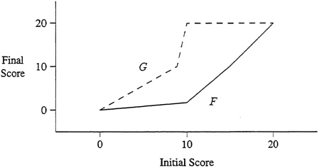
FIGURE B-1 Sample Tamp Curves
then for population F a student would have to score about 1.5 on the second test to retain the same rank in the class. A point on the curve represents a pair of scores, x and y, such that the observed frequency of scoring less than x on the first test is the same as the observed frequency of scoring less than y on the second test. For the same initial score of 8, a student from population G would need to score about 9, which is greater than 1.5, to retain his or her rank. This does not imply that every student in population G improves more than every student in population F. Quite the contrary! By subdividing the two populations on some other category (for example, gender or teacher), one may find that each of the subpopulations shows a reversal of the growth relationships.
To see how this can happen, consider a hypothetical data set that would give rise to the TAMP curve in Figure B-1. This example is adapted from Fienberg (1980). Suppose that there are 11,000 observations for students in population F and 10,100 observations for students in population G, with initial test score distribution given by:
|
|
Initial Marginal Distributions (at time 0) |
|
|
Population |
Between 0 and 9.99 |
Between 10 and 20 |
|
F0 |
1,000/11,000 |
10,000/11,000 |
|
G0 |
10,000/10,100 |
100/10,100 |
Note that this initial distribution is very unbalanced, with population F containing a high proportion of high scorers and population G containing a very high proportion of low scorers. Suppose that the final distribution is given by:
|
|
Final Marginal Distributions (at time 1) |
|
|
Population |
Between 0 and 9.99 |
Between 10 and 20 |
|
F1 |
5,850/11,000 |
5,150/11,000 |
|
G1 |
9,060/10,100 |
1,040/10,100 |
If the scores in each population are uniformly distributed in the range 0 to 9.99 and 10 to 20, then the initial and final distributions can be seen to correspond to the TAMP curve of Figure B-1. But the TAMP curve does not tell the entire story. In order to understand the progress of students in these two programs, one needs to know how many of the initial low/high scores in each population remained in the same category on the final test and how many changed categories. Suppose the transition table is given by:
|
|
Final Score and Population |
|||
|
Initial |
Between 0 and 9.99 |
Between 10 and 20 |
||
|
Score |
F |
G |
F |
G |
|
0–9.99 |
850/1,000 |
(9,000/10,000) |
150/1.000 |
(1,000/10,000) |
|
10–20 |
5,000/10,000 |
(60/100) |
5,000/10,000 |
(40/100) |
This table says that 150 of the 1,000 people in population F who started out as low scorers became high scorers on the final test. The other 850 remained low scorers. Of the 10,000 initial high scorers in population F, 5,000 became low scorers and 5,000 remained high scorers. In population F, in contrast, 9,000 of 10,000 initial low scorers remained low scorers and 60 of 100 initial high scorers became low scorers. In other words, 15 percent of population F low scorers improved to the high scoring category on the final test while only 10 percent of population G low scorers showed a similar improvement. In fact, for every starting score, population F students raised their scores more than did population G students. Yet the TAMP curve for population F is uniformly below that for population G—a result that would appear to indicate uniformly retarded progress of population F.
This phenomenon, in which the apparent result of a TAMP curve analysis contradicts what is actually happening, is an instance of a phenomenon called Simpson's paradox. Simpson's paradox can occur in situations in which the distribution of initial test scores in the two populations is very different. It is one of many ways that the two populations might not be comparable.
If the TAMP curve is drawn as a solid line (as in the examples in the Immersion Study and Figure B-1), it is impossible to know that there is a difference in the
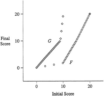
FIGURE B-2 Tamp Curves Illustrating Simpson's Paradox
initial test score distributions. If, instead, the TAMP curves actually plot the data points (or at least represent the local density of the data), unequal distributions will be readily apparent and should serve as a warning that Simpson's paradox may be a problem. Figure B-2 plots the same graphs with circles and diamonds representing data points (assuming uniform distributions and 34 people in each population). From these TAMP curves it is very easy to see that the two populations have very different marginal distributions. Nearly all students in population G score poorly on the first test, while most of those in population F score very well on the first test—exactly the situation that would warn of a difficulty in interpreting the TAMP analysis.
In summary, although TAMP provides a useful exploratory tool, users should be cautious about drawing strong conclusions. When the two populations are not comparable (for example, when the distribution of their initial tests scores are very unequal), interpreting difference in the TAMP curves is fraught with difficulties.
REFERENCES
Braun, H. I. (1988) A new approach to avoiding problems of scale in interpreting trends in mental measurement data. Journal of Educational Measurement , 25(3), 171–191.
Braun, H. I., and Holland, P. W. (1982) Observed-score test equating: A mathematical analysis of some ETS equating procedures. In P. W. Holland and D. B. Rubin, eds., Test Equating, pp. 9–49. New York: Academic Press.
Fienberg, S. E. (1980) The Analysis of Cross-Classified Categorical Data (second ed.). Cambridge, Mass.: MIT Press.
Gnanadesikan, R. (1977) Methods for Statistical Data Analysis of Multivariate Data. New York: Wiley.
Ramirez, D. J., Pasta, D. J., Yuen, S. D., Billings, D. K., and Ramey, D. R. (1991b) Final report: Longitudinal study of structured-english immersion strategy, early-exit and late-exit transitional bilingual education programs for language-minority children, Volume II. Technical report, Aquirre International, San Mateo, Calif.


