
Appendix B
Mail Returns
Research has shown that a census mail return filled out by a household member tends to be more complete in coverage and content than an enumerator-obtained return (see National Research Council, 1995:122, App.L).1 For this reason we decided at the outset of our assessment to examine the population coverage on mail returns in comparison with enumerator returns and to analyze similarities and differences in mail return rate patterns between 1990 and 2000.
In 2000, “mail” returns included returns filed over the Internet and telephone and “Be Counted” returns that had valid addresses and did not duplicate another return. The denominator for mail return rates in both 2000 and 1990 was restricted to occupied housing units in the mailback universe. The mail return rate is therefore a better measure of public cooperation than the mail response rate, which includes vacant and nonresidential units in the denominator as well (see Box 3-1 in Chapter 3).
We note that higher coverage error rates for enumerator returns do not reflect on them so much as on the difficulties of the task. With relatively little training or experience for the job, enumerators work under difficult conditions to try to obtain responses within a short period of time from households that, for whatever reason, declined or neglected to fill out and mail back their forms as requested. In that light, attempts to push mail return rates to very high levels, say, 85 or 90 percent or more, could reduce their overall quality because people who responded by mail only after extraordinary effort would likely do a poorer job of filling out their forms than other respondents. However, at the levels of mail return seen in recent censuses, the positive effect on data quality from maintaining or somewhat raising those rates appears to hold, and, hence, it is useful to understand the factors that facilitate response. Moreover, every return from a household by the mail or other medium is one less return that requires expensive follow-up in the field.
In the remainder of this chapter we summarize research from 1990 documenting the superiority of population coverage on mail returns and present largely confirmatory results from 2000. We then analyze changes in mail return rate rates for census tracts between 1990 and 2000 by a variety of characteristics. We knew that the overall reduction in net undercount in 2000 could not likely be due to mail returns, given that the total mail return rate was somewhat lower in 2000 than in 1990.2 However, we thought it possible that changes in mail return rates for particular types of areas, such as those with many renters or minority residents, might help explain the reductions in net undercount rates that the Accuracy and Coverage Evaluation (A.C.E.) Program measured for usually hard-to-count groups.
QUALITY IN 1990
Research from the 1990 census, based on a match of P-sample and E-sample records in the 1990 Post-Enumeration Survey (PES), found that mail returns were substantially more likely than returns obtained by enumerators to cover all people in the household. Only 1.8 percent of mail returns had within-household misses, defined as cases in which a mail return in the E-sample matched a P-sample housing unit but the P-sample case included one or more people who were not present in the E-sample unit. In contrast, 11.6 percent of returns obtained by enumerators had within-household misses (Siegel, 1993; see also Keeley, 1993). These rates did not vary by type of form: within-household misses were 1.9 percent and 1.8 percent for short-form and longform mail returns and 11.7 percent and 11.3 percent for short-form and longform enumerator-filled returns.
In an analysis of the 1990 PES for 1,392 post-strata, Ericksen et al. (1991: Table 1) found that both the gross omission rate and the gross erroneous enumeration rate were inversely related to the “mailback rate” (equivalent to the mail response rate) for PES cases grouped by mailback rate category.3 The relationship was stronger for omissions than for erroneous enumerations—the omission rate was 3 percent in the highest mailback rate category and 19 percent in the lowest mailback rate category, compared with 4 percent and 10 percent, respectively, for the erroneous enumeration rate. Consequently, the net undercount rate also varied inversely with the mailback rate.
QUALITY IN 2000
Using data from the A.C.E. P-sample and E-sample, we carried out several analyses of the relationship between mail returns and population coverage for 2000. The analyses are not as comparable as we would have liked to the 1990 analyses summarized above: not only are there differences between the PES and the A.C.E., but also it is difficult a decade later to determine exactly how the 1990 analyses were performed. Nonetheless, the work is sufficiently similar that we are confident that the findings, which largely confirm the 1990 results, are valid. All results presented below are weighted, using the TESFINWT variable4 in the P-Sample or E-Sample Person Dual-System Estimation Output File, as appropriate.
Within-Household Omissions and Erroneous Enumerations by Type of Return
We linked P-sample and E-sample records in the same housing units to provide a basis for calculating rates of within-household omissions for 2000 that could be compared to the 1990 rates from Siegel (1993). We also developed other classifications of linked P-sample and E-sample households.
Table B-1 shows our results: E-sample mail returns received before the cutoff for determining the nonresponse follow-up workload included proportionally fewer cases with one or more omissions or possible omissions (2.8%) than did E-sample returns that were obtained by enumerators in nonresponse follow-up (7%). The difference was in the same direction as in 1990, but it was not as pronounced. Perhaps more striking, enumerator-obtained returns in 2000 included a much higher proportion with one or more erroneous or unresolved enumerations (15.5%) than did mail returns (5.3%) (comparable data are not available for 1990). Such enumerations included duplicates, geocoding errors, people lacking enough reported data for matching, and other erroneous and unresolved enumerations.
By housing tenure, both owner-occupied households and renter households showed the same patterns: mail returns included proportionally fewer cases of within-household omissions or cases with one or more erroneous or unresolved enumerations than enumerator returns. Consistently, renter households had higher proportions of these kinds of households than owner households (comparable data are not available for 1990).
|
4 |
TESFINWT is the final person-level weight assigned to P-sample and E-sample records by the Census Bureau. It is based on each individual’s estimated probability of being included in the sample as well as their inclusion in the targeted extended search operation (see Chapter 7). |
TABLE B-1 Composition of 2000 Census Households, as Measured in the A.C.E. E-Sample, by Enumeration Status, Mail and Enumerator Returns, and Housing Tenure (weighted)
Omissions and Erroneous Enumerations by Mail Return Rate Deciles
In an analysis similar to Ericksen et al. (1991), Table B-2 classifies P-sample cases and E-sample cases in the 2000 mailback universe into 10 mail return rate categories, with each category defined to include 10 percent of the total. (The decile cutoffs are very similar between the two samples.) The mail return rate associated with each case is the rate for the census tract in which the P-sample or E-sample person resided. Within each P-sample decile, the omission rate is calculated as the ratio of valid P-sample cases that did not match an E-sample person to the total of nonmatches plus matches. Within each E-sample decile, the erroneous enumeration rate is calculated as the ratio of erroneous enumerations (duplicates, fictitious persons, etc.) to the total of erroneous enumerations plus correct enumerations.
The omission rate ranges from 3.8 percent in the highest mail return rate decile to 14.8 percent in the lowest decile. The erroneous enumeration rate ranges from 2.5 percent in the highest return rate decile to 7.2 percent in the lowest return rate decile. The differences are in the same direction as those estimated for 1990, although they are not as pronounced.5
The rate of unresolved cases in the P-sample and E-sample (cases whose match status or enumeration status could not be resolved even after field follow-up) also shows a relationship to mail return rate deciles (see Table B-2). The unresolved rate (unresolved cases as a percentage of unresolved plus matches and nonmatches for the P-sample, and as a percentage of unresolved plus correct and erroneous enumerations for the E-sample) ranges from 1.2 percent in the highest P-sample mail return rate decile to 3.6 percent in the lowest decile and from 1.3 percent in the lowest E-sample mail return rate decile to 4.5 percent in the highest decile. These results indicate that it was easier to determine match or enumeration status in areas with higher mail return rates.
Erroneous Enumerations by Domain and Tenure
In an analysis of 2000 data—for which we have not seen comparable findings for 1990—we examined erroneous enumeration rates for E-sample people (including unresolved cases) by whether their household mailed back a return or was enumerated in the field. This analysis finds considerable overall differences and for domain (race/ethnicity) and tenure groups. The analysis differs from that reported above for mail return rate deciles for 1990 and 2000 in that it uses the mail return status of the individual household to classify E-sample people and not the return rate of either the post-stratum (as in 1990) or the census tract (as in 2000).
TABLE B-2 Rates of P-Sample Omissions, E-Sample Erroneous Enumerations, and P-Sample and E-Sample Unresolved Cases in the 2000 A.C.E., by Mail Return Rate Decile of Census Tract (weighted)
|
|
P-Sample Rates (%) |
E-Sample Rates (%) |
||
|
Census Tract Decile (Return Rate Range)a |
Omissionsb |
Unresolved Casesc |
Erroneous Enumerationsd |
Unresolved Casese |
|
10th (82.8–100.0) |
3.8 |
1.2 |
2.5 |
1.3 |
|
9th (79.7–82.7) |
4.8 |
1.7 |
2.7 |
1.7 |
|
8th (77.3–79.6) |
5.2 |
1.9 |
3.2 |
1.9 |
|
7th (74.9–77.2) |
5.8 |
2.0 |
3.6 |
1.9 |
|
6th (72.6–74.8) |
6.8 |
2.2 |
3.9 |
2.1 |
|
5th (69.9–72.5) |
7.6 |
2.3 |
4.6 |
2.8 |
|
4th (66.8–69.8) |
8.3 |
2.4 |
4.6 |
2.6 |
|
3rd (63.2–66.7) |
9.4 |
2.5 |
5.0 |
3.5 |
|
2nd (57.7–63.1) |
11.6 |
3.0 |
5.7 |
4.3 |
|
1st (19.9–57.6) |
14.8 |
3.6 |
7.2 |
4.5 |
|
aThe return rate ranges shown are for the P-sample; the ranges for the E-sample are almost identical. bThe omission rate is omissions divided by the sum of omissions plus matches (excluding unresolved cases, cases removed from the P-sample as not appropriately in the sample of Census Day household residents, and inmovers who were not sent through the matching process—see Chapter 6). cThe unresolved rate for the P-sample is unresolved cases divided by the sum of omissions, matches, and unresolved cases. dThe erroneous enumeration rate is erroneous enumerations divided by the sum of erroneous enumerations, matches, and other correct enumerations. eThe unresolved rate for the E-sample is unresolved cases divided by the sum of unresolved cases, erroneous enumerations, matches, and other correct enumerations. SOURCE: Tabulations by panel staff of U.S. Census Bureau, P-Sample and E-Sample Dual-System Estimation Output Files, February 16, 2001; weighted using TESFINWT. |
||||
As shown in Table B-3, the rate of erroneous and unresolved enumerations for people on mail returns is 4.3 percent, compared with 12.6 percent for people on returns obtained by a nonresponse follow-up enumerator. For most race/ethnicity groups, people on mail returns have lower erroneous and unresolved enumeration rates than do people on enumerator-obtained returns, and owners have lower rates than renters. There are two exceptions: American Indian and Alaska Native owners living off reservations and Hawaiian and other Pacific Islander owners, for whom the rates of erroneous and unresolved enumerations are similar between mail and enumerator-obtained returns; and American Indian and Alaska Native renters living on reservations, for whom the rates of erroneous and unresolved enumerations are higher for mail returns than for enumerator-obtained returns.
For the update/leave cases, the patterns are similar to mailout/mailback cases: the rate of erroneous and unresolved enumerations for people on mail returns in update/leave areas is 3.1 percent, compared with 9.2 percent for people on enumerator-obtained returns, with rates for owners lower than those
TABLE B-3 Rates of E-Sample Erroneous Enumerations and Unresolved Cases, in Mailout/Mailback and Update/Leave Types of Enumeration Area (TEA), by Mail or Enumerator Return, Race/Ethnicity Domain, and Housing Tenure, 2000 A.C.E. (weighted)
|
|
Percent Erroneous and Unresolved Cases of Total E-Sample Enumerations |
|||
|
|
Mailout/Mailback TEA |
Update/Leave TEA |
||
|
Race/Ethnicity Domain and Tenure Category |
Mail Return |
Enumerator Return |
Mail Return |
Enumerator Return |
|
American Indian and Alaska Native on Reservation |
|
|||
|
Owner |
0.0 |
6.5 |
13.5 |
9.0 |
|
Renter |
5.1 |
1.9 |
10.2 |
3.9 |
|
American Indian and Alaska Native off Reservation |
|
|||
|
Owner |
7.2 |
7.7 |
2.2 |
8.7 |
|
Renter |
9.1 |
12.8 |
5.5 |
11.3 |
|
Hispanic |
|
|||
|
Owner |
3.4 |
8.2 |
4.0 |
7.3 |
|
Renter |
7.0 |
15.2 |
7.1 |
15.1 |
|
Black |
|
|||
|
Owner |
4.6 |
11.7 |
3.7 |
7.3 |
|
Renter |
8.4 |
16.8 |
5.6 |
10.6 |
|
Native Hawaiian and Pacific Islander |
|
|||
|
Owner |
6.6 |
6.9 |
7.4 |
6.7 |
|
Renter |
5.3 |
13.8 |
10.8 |
13.5 |
|
Asian |
|
|||
|
Owner |
4.0 |
8.8 |
3.5 |
8.5 |
|
Renter |
8.4 |
17.5 |
8.4 |
23.2 |
|
White and Other Non-Hispanic |
|
|||
|
Owner |
3.0 |
8.5 |
2.6 |
8.0 |
|
Renter |
7.2 |
16.6 |
5.2 |
12.9 |
|
Total |
4.3 |
12.6 |
3.1 |
9.2 |
|
SOURCE: Tabulations by panel staff of U.S. Census Bureau, E-Sample Person Dual-System Estimation Output File, February 16, 2001; weighted using TESFINWT. |
||||
for renters (see Table B-3). The exceptions are American Indians and Alaska Natives living on reservations, for whom people on mail returns have higher (not lower) rates of erroneous enumerations than do people on enumerator-obtained returns, and for whom owners have higher rates than renters.
There were very few list/enumerate cases, but they have high rates of erroneous and unresolved enumerations—18.3 percent (data not shown). In contrast, the rates are relatively low for rural update/enumeration (5.2%) and urban update/enumeration (2.9%). For all other enumerator-obtained returns (e.g., those obtained from new construction), the rates of erroneous and unresolved enumerations are relatively high—14.3 percent.
1990–2000 DIFFERENCES IN MAIL RETURN RATES
In this section, we examine the differences in mail return rates by census tract, to determine whether part of the reduction in net undercount for historically hard-to-count groups estimated in the 2000 census may be attributable to a higher rate of higher-quality mail returns than enumerator returns. We were also interested in the structure of return rates in the 2000 census relative to the 1990 experience: Do returns in the two censuses appear to behave similarly, and do they bear the same relationships to such factors as the demographic and socioeconomic composition of a particular tract?
The data used in this analysis are drawn from two sources. The first—detailing the 2000 mail return rates by tract—is a summary file of return rates by collection tracts provided by the Census Bureau; this file was used to determine cutoffs of “high” versus “low” return rates for different racial/ethnic domains in constructing A.C.E. post-strata.6 The second source provides 1990 return rates for tracts and links them to a set of characteristics; this source is the Bureau’s “1990 Data for Census 2000 Planning” dataset (hereafter, the planning database). This database contains tract-level data from the 1990 census on a variety of demographic and housing-stock characteristics, as well as the estimated 1990 undercount for the tract. Among the variables included in the planning database is a hard-to-count score—based on percentile ranks in 11 of the demographic variables—that was used by the Bureau to identify “areas with concentrations of attributes that make enumeration difficult.” This hard-to-count score can range from 0 to 132, with higher values indicating more difficult-to-count areas.
Since our primary interest is in comparing the 1990 and 2000 return rates, we restricted our attention to those tracts for which both rates are available: that is, we excluded those cases that did not have a mailout/mailback or update/leave component in both censuses. We also tried to avoid some of the noise created by small “sliver” tracts with little to no population; hence, we omitted those tracts for which either the 1990 or the 2000 mail return rates were exactly equal to zero. Our analysis set consisted of 55,688 tracts; our effective sample size when we performed regression analyses using the planning database characteristics is reduced slightly from that total due to missing values in the database.
This analysis should be considered tentative because the range of variables available for explanatory purposes is limited by geographic differences: the return rate summary files are given in 2000 census collection geography, which has somewhat different boundaries and very different numbering mechanisms from the geography used to tabulate data files for public release (e.g., the 2000
census redistricting data files). It may be of interest to use demographic information from the 2000 census as explanatory variables rather than just the 1990 figures—for instance, one might be interested in looking at mail return rates in areas that underwent major changes in their racial or age composition over the 1990s. Such analyses await the release of full information from the census, including the long form, and should be part of the Census Bureau’s program of evaluations.
Comparison
In general, a tract’s mail return rate in the 2000 census tended to be close to its 1990 mail return rate; this conclusion is made clear in Figure B-1, which plots the mail return rates by tract for both censuses. The points are fairly tightly clustered near the 45-degree line; the correlation between the two variables is 0.79, and a simple linear regression fit to the data registers a slope of 0.78. The agreement between 1990 and 2000 rates is far from perfect, however; there is a fringe of points with near-perfect rates in one of the two censuses (mainly less-populated tracts). More significantly, the scatterplot suggests a slight bulge below the 45-degree line in the central cloud of points; this suggests a considerable number of tracts for which high 1990 mail return rates dropped off in 2000.
The boxplots along the margins of the scatterplot indicate the marginal distributions of the return rates in the two censuses.7 The boxplots suggest that the tract-level return rates in 2000 tend to be slightly lower than in 1990; the median among the 2000 return rates is 72.2; the 1990 median is 76.5. However, the two distributions share essentially the same variability as measured by interquartile range: for 2000 the first and third quartiles are 64.5 and 78.7, respectively; for 1990 the quartiles are 68.5 and 82.9, respectively.
In general, then, 2000 mail return rates closely resembled 1990 mail return rates by tract, with some tendency for high-return tracts from 1990 to register a lower return rate in 2000. This conclusion is consistent with previous Census Bureau research on the structure of mail response rates, which are a slightly different construct than the mail return rates we examine here (Word, 1997).
Correlates of Rates and Change in Return Rate
Previous research on mail return rates for the census indicated fairly stable relationships between small-area demographic characteristics and response rates. For instance, high return rates have been found to be positively correlated with higher income and educational attainment, while impoverished
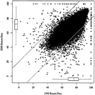
FIGURE B-1 Plot of 2000 and 1990 mail return rates.
NOTES: Each point represents one of 55,688 tracts for which both rates are available and for which neither the 1990 nor the 2000 mail return rate equals zero. Boxplots along the margins of the plot summarize the univariate (marginal) distribution of the two rates; see text for details. Two diagonal lines (intercepts ±20 and slope 1) demarcate those tracts whose mail return rates experienced changes of 20 percentage points or more between 1990 and 2000.
areas and areas with high concentrations of residents with limited English proficiency usually have lower return rates (Word, 1997; Salvo and Lobo, 1997).
Table B-4 displays the results of stepwise regression analysis, using the 1990 census characteristics from the planning database as predictors of three separate dependent variables: the change in mail return rate from 1990 to 2000, the raw 2000 return rate, and the raw 1990 return rate. Terms in the model had to achieve significance at the 0.05 level in order to enter or remain in the model. Achieving statistical significance in a dataset of over 50,000 records is not as telling as practical significance, though. To gauge the impact of each predictor, we multiplied the estimated coefficient by the interquartile range (third quartile minus first quartile); this value is tabulated as the “impact” and may be interpreted as the change in the response variable induced by a change from low to high values of the predictor, controlling for the effects of the other variables in the model.
It is apparent that none of the predictor variables available in the planning
TABLE B-4 Summary of Tract-Level Regression Models Using the Planning Database as the Source of Predictor Variables
|
|
Change in Return Rate, 1990–2000 (R2 = 0.19) |
2000 Return Rate (R2 = 0.69) |
1990 Return Rate (R2 = 0.75) |
|||
|
Variable |
Coef |
Impacta |
Coef |
Impacta |
Coef |
Impacta |
|
Census-Related Variables |
|
|||||
|
1990 PES % Net Undercount |
–0.13 |
–0.28 |
–0.90 |
–1.90 |
–0.77 |
–1.62 |
|
Hard-to-Count Score |
–0.03 |
–1.31 |
–0.12 |
–5.14 |
–0.09 |
–3.85 |
|
Demographic Composition |
|
|||||
|
Log(1990 Population + 1) |
0.51 |
0.33 |
1.34 |
0.87 |
0.83 |
0.54 |
|
% American Indian/Alaska Native |
|
|
–0.21 |
–0.08 |
–0.19 |
–0.08 |
|
% Asian/Pacific Islander |
–0.05 |
–0.11 |
–0.06 |
–0.13 |
–0.01 |
–0.02 |
|
% Black |
0.03 |
0.37 |
–0.08 |
–0.96 |
–0.11 |
–1.33 |
|
% Hispanic |
–0.01 |
–0.08 |
0.03 |
0.15 |
0.04 |
0.22 |
|
% Population Over Age 65 |
–0.04 |
–0.30 |
0.24 |
1.94 |
0.28 |
2.25 |
|
% Population Under Age 18 |
0.06 |
0.42 |
|
|
–0.05 |
–0.41 |
|
% Linguistically Isolated Households |
|
|
0.05 |
0.14 |
0.06 |
0.16 |
|
% Recent Movers |
0.10 |
1.16 |
0.04 |
0.44 |
–0.06 |
–0.71 |
|
% People in Group Quarters |
0.03 |
0.05 |
–0.01 |
–0.02 |
–0.04 |
–0.07 |
|
% Non-Husband/Wife Families |
0.02 |
0.48 |
–0.02 |
–0.45 |
–0.04 |
–0.92 |
|
% Occupied Units with No Phone |
–0.07 |
–0.53 |
–0.15 |
–1.13 |
–0.08 |
–0.61 |
|
Housing Stock |
|
|||||
|
% Units in 10+ Unit Structures |
0.04 |
0.62 |
0.08 |
1.20 |
0.04 |
0.57 |
|
% Units in 2+ Unit Structures |
–0.02 |
–0.54 |
–0.11 |
–3.30 |
–0.09 |
–2.72 |
|
% Crowded Units |
0.20 |
0.88 |
0.02 |
0.07 |
–0.19 |
–0.82 |
|
% Housing Units Vacant |
–0.02 |
–0.16 |
–0.11 |
–0.74 |
–0.09 |
–0.57 |
|
% Renter-Occupied Units |
|
|
–0.01 |
–0.27 |
–0.01 |
–0.34 |
|
% Trailers/Mobile Homes |
|
|
–0.04 |
–0.38 |
–0.04 |
–0.41 |
|
Economic and Educational Conditions |
|
|||||
|
% People Unemployed |
0.11 |
0.56 |
0.05 |
0.24 |
–0.06 |
–0.32 |
|
% People Not High School Graduates |
–0.04 |
–0.98 |
–0.11 |
–2.45 |
–0.07 |
–1.46 |
|
% Households on Public Assistance |
0.08 |
0.58 |
0.17 |
1.29 |
0.09 |
0.71 |
|
% People Below Poverty |
–0.06 |
–0.88 |
0.03 |
0.38 |
0.09 |
1.26 |
|
Geographic Division Indicators |
|
|||||
|
East North Central |
|
–3.18 |
|
1.33 |
|
4.52 |
|
East South Central |
|
–3.42 |
|
–0.93 |
|
2.51 |
|
Mid-Atlantic |
|
–2.40 |
|
–2.07 |
|
0.33 |
|
Mountain |
|
–1.42 |
|
–0.45 |
|
0.98 |
|
New England |
|
1.49 |
|
–1.77 |
|
–3.28 |
|
South Atlantic |
|
–2.08 |
|
|
|
2.12 |
|
West North Central |
|
–3.57 |
|
1.14 |
|
4.72 |
|
West South Central |
|
–4.17 |
|
–0.66 |
|
3.51 |
|
NOTES: Separate models were fit using each of three response variables indicated in the column headings. The operative sample size was 54,278, which includes tracts for which both rates are non-zero and none of the predictor variables includes missing values. Models were fit using stepwise regression, requiring significance at the 0.05 level to enter or remain in the model. In the set of geographic region indicators, the Pacific division is the omitted dummy variable. aNumber equals the estimated coefficient multiplied by the interquartile range (third quartile minus first quartile) and may be interpreted as the change in the response variable induced by a change from low to high values of the predictor, controlling for the effects of other variables in the model. SOURCE: Analysis by panel staff of U.S. Census Bureau, Return Rate Summary File (U.S.), February 26, 2001, and 1990 Planning Database. |
||||||
database is very informative in explaining the change in return rate from 1990 to 2000. The strongest correlations between any of them and the change in return rate are ±0.16 (positive for the percentage of persons living in crowded units, negative for the percentage of persons aged 65 and older), and the R2 of the stepwise regression model searching over this set of variables is only 0.19. None of the planning database predictors in the model for change in return rate has a noticeable effect. However, it is interesting to note that the largest practical effects are those created through the dummy variables for census geographic division. The size of the coefficients suggests that the Pacific division (the omitted dummy variable) and New England both tended to have tracts that increased their return rates, while other areas—notably the West Central divisions—showed marked declines (see below).
The other two models illustrated in Table B-4 are those using the 2000 and 1990 return rates, respectively, as the dependent variable; the fitted models that result are strikingly similar in both the sign and the magnitude of the coefficients. Some discrepancies between the two models arise—signs differ on the coefficient associated with percentage of recent movers, and the geographic effects are consistent with markedly higher rates in the central regions of the country in 1990 than in 2000. Except for local geographic differences, 1990 and 2000 mail return rates may effectively be estimated by the same regression equation, in which the 1990 hard-to-count score, percentage net undercount, percentage people in multi-unit structures, and percentage people who were not high school graduates have large negative effects and 1990 percentage population over age 65 has a strong positive effect.
Geographic Variation
While none of the characteristics that are readily accessible are strongly related to the change in mail return rate between 1990 and 2000, the geographic region indicators we included in the model do show some of the largest effects. Further analysis of the change in return rates suggests interesting geographic patterning—more subtle than can be captured by simple regional dummies—for reasons that are not immediately obvious.
In this section of the analysis, we further restrict our focus to the 965 tracts in our dataset for which the 2000 mail return was either 20 percentage points higher or lower than in 1990. The 20 percent cutoff is arbitrary in the sense that it is not motivated by any theoretical concern; visually, though, the 20 percent cutoff does appear to shear off much of the bulge below the 45-degree line that is depicted in Figure B-1. Of these tracts thus considered, 780 had a 2000 mail return rate at least 20 percent lower than in 1990 levels, and 185 had a 20 percent higher rate than in 1990. Points representing these 965 tracts are shown on a national-level map in Figure B-2. For finer detail, Figure B-3 shows the Northeast corridor from Washington to New York.
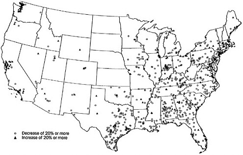
FIGURE B-2 Census tracts whose mail return rate increased or decreased by at least 20 percent between 1990 and 2000.
NOTES: Census tracts are indicated by a randomly-selected point inside the tract’s boundary. Not shown on the map are two sharp-decline tracts in Anchorage, Alaska, and two sharp-decline tracts and two sharp-increase tracts in Honolulu, Hawaii.
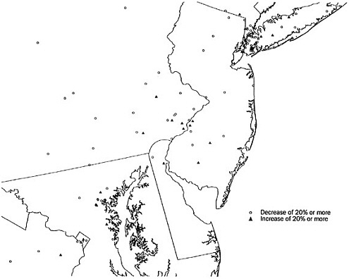
The maps reveal a surprising level of structure and suggest how localized clustering of similar return rates can be. There is a strong concordance between 1990 and 2000 rates in the Plains and Mountain states. In contrast, the large majority of the tracts experiencing 20 percent or more dips in return rate lie in the eastern United States, beginning in central Texas. Large clusters of lower return rates are evident in various parts of the map, perhaps most strikingly in central Indiana and in Brooklyn, New York (Figure B-3), and abound throughout Kentucky, Tennessee, and the Carolinas. At the other extreme, as suggested by our regression models, the tracts that experienced higher mail return rates are concentrated in the Pacific division (particularly around Los Angeles and the extended Bay Area) and also in New England. Within the nation’s largest cities (save, perhaps, Los Angeles), similar return rates are concentrated in portions of the city; a zoom-in on Chicago highlights a cluster of tracts with lower return rates on the west and south sides of the city (data not shown), while the striking cluster of tracts with lower rates in Brooklyn contrasts markedly with other portions of New York City (see Figure B-3).
These geographic effects are consistent with the broad geographic dummies (by division) incorporated in our regression models. Furthermore, these extreme-value tracts have higher hard-to-count scores (with half of the values lying between the first quartile 22 and third quartile 58, with median 39) than do tracts whose change in return rates was less than 20 percent (first quartile 9 and third quartile 51, with median 27). But the effects do not suggest any other obvious explanatory factors. There does not, for instance, appear to be an unban/suburban/rural divide at work, nor do areas of either growth or decline in return rate appear to correspond with areas experiencing greater population growth over the 1990s and for which new construction might be a major part of the address list. Again, our analysis here is limited by the available data; we look forward to the Census Bureau’s evaluations of factors influencing mail return rates.
CONCLUSION
We did not find that changes in mail return rates explain the reductions in net undercount rates shown in the A.C.E. In fact, our analysis found very similar mail return patterns between the 1990 and 2000 censuses. The patterns in each census were explained by much the same variables, and the available demographic and socioeconomic characteristics for tracts did not explain changes between 1990 and 2000. However, census tracts experiencing unusually large increases or decreases in mail return rates did show a tendency to cluster geographically. Further investigation of these clusters and of local operations and outreach activities in these areas would be useful to identify possible problems and successes to consider for 2010 census planning.


