
12
Geographic Differences in Life Expectancy at Age 50 in the United States Compared with Other High-Income Countries
John R. Wilmoth, Carl Boe, and Magali Barbieri
INTRODUCTION
Just as mortality differs across countries, it also differs geographically within countries. In the United States, for example, the range of life expectancy at birth (e0) for the years 1999-2001 extended from 72.3 for the District of Columbia (lowest) and 73.6 for Mississippi (second lowest) to 79.0 for Minnesota (second highest) and 79.7 for Hawaii (highest).1 Life expectancy at age 50 (e50) for the same years reflected a similar hierarchy: from 28.0 for both the District of Columbia and Mississippi to 31.4 for Minnesota and 32.4 for Hawaii. These ranges are smaller than those found across a broad group of high- and middle-income countries in 2000 (see Table 12-1). They are, however, larger once we exclude countries of Eastern Europe and the former Soviet Union from the comparison set.
The geographic variation of life expectancy at age 50 in the United States is illustrated here in Figure 12-1, which shows results separated by sex (men and women) and by administrative unit (states and counties). The broad pattern of geographic variation is similar across the four panels of Figure 12-1: relatively low values of e50 in the District of Columbia and across a large area of the Southeast, extending northward into Appalachia and to a lesser extent into parts of the Great Lakes region; and relatively high values of e50 across the far north central region of the country, extending into the mountain states as well.
Despite an increasing trend in life expectancy during the latter half
TABLE 12-1 Life Expectancy at Birth and at Age 50 in States of the United States and Two Sets of Comparison Countries (in 2000)
|
Areas |
Life Expectancy at Birth (in years) |
Life Expectancy at Age 50 (in years) |
||||
|
Min |
Max |
Range |
Min |
Max |
Range |
|
|
States of the United States |
72.3 |
79.7 |
7.4 |
28.0 |
32.4 |
4.4 |
|
All comparison countries |
65.4 |
81.4 |
16.0 |
23.0 |
33.2 |
10.2 |
|
Selected high-income countries |
76.7 |
81.4 |
4.7 |
29.1 |
33.2 |
4.1 |
|
NOTES: The full set of comparison countries includes Australia, Austria, Belarus, Belgium, Bulgaria, Canada, Chile, the Czech Republic, Denmark, Estonia, Finland, France, Germany, Hungary, Iceland, Ireland, Israel, Italy, Japan, Latvia, Lithuania, Luxembourg, the Netherlands, New Zealand, Norway, Poland, Portugal, Russia, Slovakia, Slovenia, Spain, Sweden, Switzerland, Taiwan, Ukraine, the United Kingdom, and the United States. The selected set of countries includes all of the above except Chile, Israel, and Taiwan plus countries of Eastern Europe and the former Soviet Union (Belarus, Bulgaria, the Czech Republic, Estonia, Hungary, Latvia, Lithuania, Poland, Russia, Slovakia, Slovenia, and Ukraine). SOURCE: Data from the Human Mortality Database (see http://www.mortality.org [accessed July 26, 2009]). |
||||||
of the 20th century at all ages and for all states (plus the District of Columbia), the rankings of the various states or regions in this geographic hierarchy have changed rather little over this time period (National Center for Health Statistics, 1975, 1998). Moreover, in a recent investigation at the county level, Ezzati and colleagues uncovered an even greater range of disparities in life expectancy at birth in the United States, of around 13 years for women and 18 years for men in 1999 (Ezzati et al., 2008). The authors point out that, whereas geographic variability diminished during the 1960s and 1970s, the distribution of e0 by county in the United States started to diverge from the early 1980s onward. They demonstrated that this divergence—which was more pronounced for women than for men—was due to disparate trends affecting the more and the less advantaged areas of the country, as the former experienced a continuous rise in longevity while the latter experienced stagnation and, in the most extreme cases, a partial reversal of gains achieved in previous decades.
The divergence of the geographic distribution of mean longevity in the United States during the last two decades of the 20th century coincided with a rapid fall in the country’s position in international rankings with respect to various measures of mortality or longevity. The deterioration of the U.S. position is well documented with regard to infant mortality (for a recent discussion on this topic, see in particular MacDorman and Mathews, 2008) but appears to be less well known regarding mortality at older ages.
In 1980, among the full set of comparison countries used here,2 values of life expectancy at age 50 extended from 24.2 for Hungary and the Czech Republic to 29.6 for Iceland, and the United States ranked 10th out of 33 with an e50 of 28.0 (Human Mortality Database, see http://www.mortality.org [accessed November 13, 2009]).3 By 2006, the level of e50 for the United States had risen to 31.3, a gain of 3.3 years. Over the same period, however, other countries experienced an even faster pace of improvement. Japan, with an e50 of 34.4 in 2006, had moved into the top position by gaining 5.5 years since 1980. As a result of its relatively poor performance during these years, the position of the United States fell to 20th among the 34 comparison countries with data available in 2006. In fact, only Taiwan, Denmark, and the 12 countries of Eastern Europe and the former Soviet Union fared worse than the United States at that time.
Figure 12-2 illustrates the change in international ranking for e50 among a more limited collection of comparison countries (excluding countries of Eastern Europe and the former Soviet Union, where mortality trends have been consistently less favorable than in the United States since 1980). The figure shows that, whereas until 1994 the United States was positioned among the upper 50 percent of the countries (not weighted by population size) with a rank that fluctuated between 9th and 12th, it lost position rapidly thereafter, falling to 13th in 1996, 14th in 1997, 18th in 1999, and 20th in 2005 and 2006 (just above Denmark in the list of 21 countries with data available for the most recent years).4 Although the difference in e50 between the United States and the highest-ranking country was just 1.6 years in 1980, it grew to 2.2 years in 1995, 3.0 years in 2000, and 3.1 years in 2006.
Like the geographic divergence in the United States, the loss of position by the country in these rankings has been much more severe for women than for men. From 1980 to 2006, the ranking of U.S. women in terms of e50 fell from 11th to 20th (out of 21 countries) and for U.S. men from 10th to 15th.5 Among all 21 countries on Figure 12-2, only Danish women had shorter lives, on average, after age 50 than U.S. women in 2006. Furthermore, the gap that separates the United States from other high-income countries is growing: whereas in 1980 women in the United States lived an average of
|
2 |
The set includes Western Europe (see the notes to Table 12-1) and other high-income countries (Australia, Canada, Japan, New Zealand, and Taiwan), plus certain countries of Eastern Europe and the former Soviet Union (Belarus, Bulgaria, the Czech Republic, Estonia, East Germany, Hungary, Latvia, Lithuania, Poland, Russia, Slovakia, and Ukraine). |
|
3 |
The country with the highest life expectancy is ranked first. |
|
4 |
See the notes to Table 12-1 for a list of the countries included in the comparison. |
|
5 |
If we include Taiwan and countries of Eastern Europe and the former Soviet Union in this comparison, the ranking of U.S. women fell from 11th (out of 33) to 22nd (out of 34) and for U.S. men from 10th to 15th. |
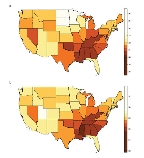
FIGURE 12-1 Geographic variation in life expectancy at age 50 in the contiguous United States, 2000.
(a) Female life expectancy at age 50 (e50) by state
(b) Male life expectancy at age 50 (e50) by state
(c) Female life expectancy at age 50 (e50) by county
(d) Male life expectancy at age 50 (e50) by county
NOTES: Both state and county data are centered on the year 2000. State data refer to years 1999-2001; county data, to years 1998-2002.
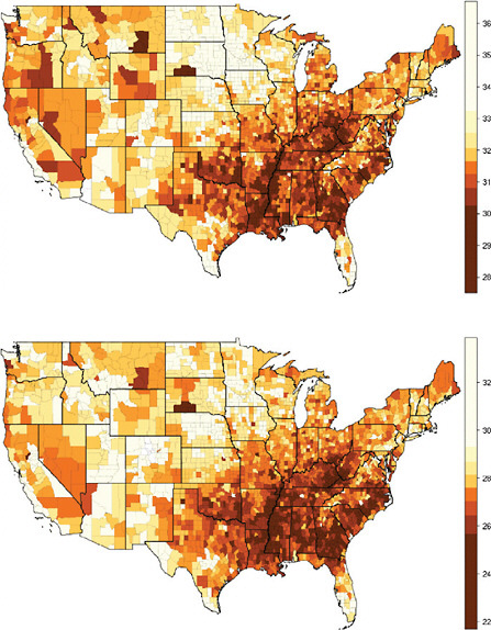
Many of the 3,141 counties in the United States are too small for reliable estimation of mortality. The 2,068 “counties” used here consist of 1,439 individual counties and 629 merged county units (thus, an average of 2.7 counties per merged unit).
SOURCES: For (a) and (b), authors’ calculations based on data for 1999, 2000, and 2001 from the National Center for Health Statistics and the U.S. Census Bureau (from data files provided by Andrew Fenelon); for (c) and (d), Ezzati et al. (2008) (from updated data files provided by Sandeep Kulkarni).
FIGURE 12-2 U.S. rankings for life expectancy at age 50 (e50) among selected high-income countries, 1980-2006.
(a) Women
(b) Men
NOTES: The full set of comparison countries includes Australia, Austria, Belarus, Belgium, Bulgaria, Canada, Chile, the Czech Republic, Denmark, Estonia, Finland, France, Germany, Hungary, Iceland, Ireland, Israel, Italy, Japan, Latvia, Lithuania, Luxembourg, the Netherlands, New Zealand, Norway, Poland, Portugal, Russia, Slovakia, Slovenia, Spain, Sweden, Switzerland, Taiwan, Ukraine, the United
just 1.1 years less on average than women in Iceland (who had the highest value of e50 at that time), in 2006 they lived 4.1 years less than women in Japan. Men in the United States are doing better in international rankings and have also been more successful than women at progressively narrowing the gap that separates them from the top-ranking countries (Iceland in 1980, Australia in 2006) in terms of e50, reducing this difference from 2.5 years in 1980 to 1.3 years in 2006.
Given the coincidence of timing (from the early 1980s until recently) and the shared characteristic of a greater impact on women, it is natural to inquire whether the increasing geographic disparity observed by Ezzati and colleagues is related in some causal fashion to the reduced pace of increase in values of life expectancy for the United States and thus to the country’s loss of position in international rankings for this key indicator of population health. In the simple model of change proposed here (see the section on Methods), narrowing the gap between the most and the least advantaged
Kingdom, and the United States.
The selected set of countries includes all of the above except Chile, Israel, and Taiwan plus countries of Eastern Europe and the former Soviet Union (Belarus, Bulgaria, the Czech Republic, Estonia, Hungary, Latvia, Lithuania, Poland, Russia, Slovakia, Slovenia, and Ukraine).
Annual data were available from 1980 for all countries included here; data series end in 2006 for all countries except Austria (2005) and New Zealand (2003).
SOURCE: Data from the Human Mortality Database (see http://www.mortality.org [accessed July 2009]).
areas of a country tends to accelerate a rise in longevity, whereas widening this gap tends to slow down and may even halt or reverse an increasing trend.
In this chapter we compare levels and trends in the variability of life expectancy at age 50 in the United States and four other countries (Canada, France, Germany, and Japan) and across an aggregate of countries or subnational areas of Western Europe. Our main purpose is to determine whether the increasing disparity in values of life expectancy in the United States may have contributed in a mechanical or otherwise causal fashion to the country’s deteriorating position in international comparisons.
THEORETICAL FRAMEWORK
Although social and economic inequality is often cited as an explanation for the poor ranking of the United States in international comparisons
of mortality or longevity, the exact nature of the connection is by no means obvious. In some studies, mortality or longevity is viewed as a response variable that can be expressed as a function of a stimulus variable, such as income.6 In this framework, an important question is whether variability in income (or some other stimulus) is negatively associated with levels of average longevity: in other words, can one attribute a lower level of life expectancy for some population to its higher level of income inequality? The correct answer is not necessarily “yes.” In fact, if the functional relationship between stimulus and response is linear, a symmetrical increase of variability in the stimulus induces no change in the response, as gains in longevity for those at the top of the income distribution are balanced exactly by losses for those at the bottom (see Duleep, 1995; Rodgers, 1979).
In the specific case of income, however, the functional relationship with longevity is distinctly nonlinear: as demonstrated using both aggregate-and individual-level data, gains in longevity decelerate sharply as income rises (Preston, 2007; Preston and Taubman, 1994; Antonovsky, 1967). In general, if a positive relationship between stimulus and response becomes weaker at higher levels of the stimulus, a symmetrical increase of inequality in the stimulus leads necessarily to a decrease of the mean response: in our example, gains in longevity by those at the top of the distribution have less impact on the mean longevity of the population than losses by those at the bottom.7
The problem posed here, however, is somewhat different, as we are studying the relationship between trends in the mean and the variance of a single variable, with no model of stimulus and response. In this situation, quantifying the contribution of changes in variance to changes in mean requires choosing a reference group in the population, which could be the highest-ranking half, third, fifth, etc., in terms of the variable of interest (here, life expectancy at age 50). By thus identifying a “leading group” in the population, we develop in the next section a simple means of quantifying the contribution of changes in the geographic distribution of longevity in a population to changes in mean longevity.
In this way we are able to obtain some key insights about the role of changing geographic disparities in e50 to trends in e50 itself for the United States and other high-income countries. Using this framework, convergence of subnational levels of e50 helps to accelerate the national trend, as the less
advantaged locations catch up to the leaders;8 conversely, divergence slows down the national increase, as the laggards fall farther and farther behind the more advantaged locations.
Although we are focusing here on the variation of mean longevity across geographically delimited population groups, it is also possible to analyze levels and trends of inequality among individual members of a population. Studies of the “compression of mortality” or “rectangularization of the survival curve” address the issue of internal variability for a given population as described by the distribution of deaths in a life table (Wilmoth and Horiuchi, 1999; Edwards and Tuljapurkar, 2005): we may call this intrapopulation variability. In contrast, the approach we are following here consists of studying inequality across countries or their geographic subunits: interpopulation variability. Both of these notions of variability or inequality of longevity are valid, and a more comprehensive analysis of the effects of changes in inequality on changes in mean longevity would take both perspectives into account. In this chapter, however, we focus on aggregate geographic differences as a means of gaining some preliminary insights into this matter.
DATA
Mortality indicators for selected years from 1950 to 2006 were collected for the United States, Canada, Japan, and 19 national or large subnational areas of Western Europe, namely Austria, Belgium, Denmark, England and Wales, Finland, France, West Germany, Iceland, Republic of Ireland, Northern Ireland, Italy, Luxembourg, the Netherlands, Norway, Portugal, Scotland, Spain, Sweden, and Switzerland. These estimates were obtained from the Human Mortality Database (see http://www.mortality.org [accessed July 26, 2009]) and are based on information from vital registration, censuses, and when available, population registers. These data series begin in 1950 or earlier for all except two countries, West Germany (1956) and Luxembourg (1960).
We gathered regional data on mortality and longevity for five countries for which such information was readily available to us; in addition to the United States, this group includes Canada, France, Germany, and Japan. Whenever possible, we collected full life tables from the available published sources. However, in some cases we collected only values for the expectation of life, as this is the main indicator used for this analysis. Annex A contains a detailed accounting of the data sources used.
The size of basic geographic units varies enormously by country, as does presumably their heterogeneity, reflecting national traditions with regard to administrative divisions and political functions. Thus, we obtained data for states and counties of the United States, for prefectures of Japan, for departments of France, for provinces of Canada, and for federal states of Germany. The underlying idea was that counties of the United States could be compared with relatively smaller administrative units in other countries, whereas states of the United States could be compared with larger administrative units within countries and with countries of Western Europe.
At one level of aggregation, the United States is composed of 50 states plus the District of Columbia, with an average population (in 2000) of 5.5 million persons and an average surface area of 189 square kilometers. At another level the country can be divided into 3,141 counties; however, since many of these counties are too small for reliable mortality estimation, we have adopted the practice of Ezzati and colleagues by analyzing data for 2,068 individual counties or merged county aggregates, with an average population (in 2000) of 136,000 people and an average surface area of around 5 square kilometers.
For two of the comparison countries, the internal geographic divisions used here are relatively detailed and thus similar in some respects to U.S. counties. The 47 prefectures of Japan and the 96 departments of France are roughly similar in physical size although much more populous on average than U.S. counties (see Table 12-2). For the other two comparison countries, available data refer to much larger geographic subunits. In terms of average population, the 10 provinces of Canada and the 15 federal states of Germany resemble states of the United States (see Table 12-2).
In many cases the estimates of life expectancy used here refer to multiyear time periods rather than a single calendar year. To simplify the exposition, we often refer to multiyear estimates in terms of the middle year. For states of the United States, data refer to 3-year time periods around census years: 1939-1941, 1949-1951,…, 1999-2001. Note that for 1939-1941 and 1949-1951, the life table values are available only for whites and for nonwhites separately and for men and women separately as well. The life tables for 1959-1961 include estimates for the total population with sexes combined, but not separately by sex. Using various assumptions (see Annex A), we have approximated some missing pieces of information for purposes of this analysis. For U.S. counties, data refer to 5-year intervals around single calendar years from 1961 to 2003. Thus, it should be understood that when we cite estimates of life expectancy for states or counties in, say, 1990, the data refer to 1989-1991 for states and 1988-1992 for counties. Some of the data for French departments also refer to multiyear time periods.
TABLE 12-2 Summary of Data on Geographic Variation in Mortality in Five Countries and Across Countries of Western Europe
|
Country |
Geographic Division |
Number of Subunits |
Date Range of Data Used Here |
In 2000: |
|||
|
Population (Millions) |
Surface Area, sq km (1,000s) |
Average Population (1,000s) |
Average Area, sq km (1,000s) |
||||
|
Canada |
Provinces |
10 |
1921-2005 |
31 |
9,971 |
3,100 |
997 |
|
France |
Departments |
91-96 |
1922-1999 |
59 |
552 |
614 |
6 |
|
Germany |
States + Berlin |
16-17 |
1990-2007 |
82 |
357 |
5,125 |
22 |
|
Japan |
Prefectures |
46-47 |
1965-2005 |
125 |
378 |
2,660 |
8 |
|
United States |
States + DC |
49-51 |
1940-2000 |
282 |
9,629 |
5,529 |
189 |
|
|
counties |
2068 |
1961-2003 |
282 |
9,629 |
136 |
5 |
|
Mostly countries |
Western Europe |
17-19 |
1950-2005 |
362 |
3,470 |
19,053 |
183 |
|
NOTES: Many of the 3,141 counties in the United States are too small for reliable estimation of mortality. The 2,068 “counties” used here consist of 1,439 individual counties and 629 merged county units (thus, an average of 2.7 counties per merged unit). Western Europe is not a country but rather a statistical conglomeration that consists of the following countries and subnational areas: Austria, Belgium, Denmark, England and Wales, Finland, France, Iceland, Republic of Ireland, Northern Ireland, Italy, Luxembourg, the Netherlands, Norway, Portugal, Scotland, Spain, Sweden, Switzerland, and West Germany. All data are from the Human Mortality Database (see http://www.mortality.org [accessed July 26, 2009]). Data for 1950 are unavailable for West Germany and Luxembourg. Some data used here refer to multiyear time periods. Such information is identified here by the middle year of the time period. For a more complete description of data and sources, see Annex A. SOURCE: For population size, data from the Human Mortality Database (see http://www.mortality.org [accessed July 2009]); for surface area, data from the Demographic Yearbook 2000 (see http://unstats.un.org [accessed July 2009]). |
|||||||
METHODS
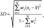
The analysis of geographic variability presented here is based entirely on period values of life expectancy at age 50, e50, measured at both national and subnational levels. Life expectancy at age 50 was chosen as the main indicator of mortality at older ages to comport with the other studies in this volume. Some of our methods of presenting and manipulating this measure of mean longevity are standard and require no explanation. For example, Figure 12-3 presents the level of female versus male e50 by state in 1950 and 2000 in the form of a simple scatter plot. Other methods are somewhat less traditional and require additional documentation.
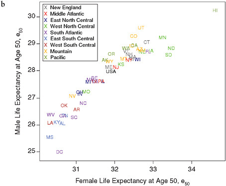
The ellipses of Figure 12-4 were derived by the method of principal components. As explained in more detail in Annex B, the axes of each ellipse are aligned with the first and second principal components of the bivariate distribution of male and female e50 for a given population and time period. The size of the ellipse is the minimum required in order to include at least 90 percent of the data points. The method is similar though not identical to that used by Coale and colleagues in their historical analysis of the decline of fertility in Europe (Coale and Treadway, 1986).
As a global measure of the geographic variability of life expectancy in a population, we computed the standard deviation across N population subunits, taking into account their relative sizes. For each population and time period, the weighted standard deviation of e50 was computed as follows:
where x1, x2, … , xN represent the values of e50 across N subunits, and w1,w2, … , wN are weights proportional to population size (scaled so that ![]() , and
, and ![]() is a weighted mean.9 Trends in this measure of variability are presented in Figure 12-5.
is a weighted mean.9 Trends in this measure of variability are presented in Figure 12-5.
Both the quintile trends of Figures 12-6 and 12-7 and the analysis of convergence effects in Table 12-3 and 12-4 require the computation of percentiles for empirical distributions of e50 across geographic space. The input for such calculations includes not only the value of e50 but also the associ-
ated population size for all geographic subunits. Using the same notation as above but specifying that the values of e50 for population subunits (x1, x2, … , xN) are in increasing order, the value of the 100p-th percentile of e50 equals xk, where k is the smallest integer (between 1 and N) such that
In standard usage, the term “quintile” may refer either to the value of cut points located at the 20th, 40th, 60th, and 80th percentiles or to each of five equal-sized groups of ordered observations (where some observations are split in appropriate proportions across adjacent groups). For this analysis, a quintile has the latter meaning. A key set of results (see Figures 12-6 and 12-7) consists of trends in the average value of e50 within the five quintiles of a given population.10
The results presented in Tables 12-3 and 12-4 involve dividing the various populations into two equal-sized groups of ordered observations and, as before, computing the average value of e50 for each half in (or around) the years 1980 and 2000.11 The focus of this analysis is the mean change in values of e50 between these 2 calendar years (in years per annum) for the population as a whole and for the two halves, as described in columns (a), (b), and (c) of Table 12-3. The mean change for the entire population is the average of mean changes for the two halves.12
We define a convergence effect to be the difference between the mean changes for the total population and for the upper half of the geographic distribution, as shown in column (d) of Table 12-3; this effect also equals one-half the difference between the mean changes for the lower and upper halves of the distribution. So defined, the convergence effect represents the increased rate of change for the total population that is attributable to faster change in the lower half of the geographic distribution compared with the upper half. If change is faster in the upper half, the value is negative and thus represents a divergence effect. Finally, column (e) of Table 12-3 gives the magnitude of the convergence effect as a fraction of the total change.
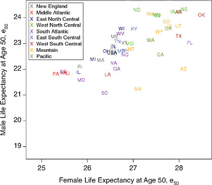
FIGURE 12-3 Levels of life expectancy at age 50 (e50) by sex and state, United States 1950 and 2000.
(a) 1950
(b) 2000
The values of Table 12-4, which are derived directly from those of Table 12-3, indicate how the differential pace of increase in e50 from 1980 to 2000 (for the United States compared with the other populations in the study) can be apportioned to each of three components. A slower pace of improvement for the United States can result from (1) a difference in the trends of e50 for the upper 50 percent of the geographic distribution in the United States versus the upper 50 percent of the geographic distribution for the comparison population, (2) a divergence between the lower and the upper 50 percent of the geographic distribution for the United States,
SOURCES: Data for 1950, from National Office of Vital Statistics, State and Regional Life Tables: 1949-51; for 2000 , authors’ calculations based on data for 1999, 2000, and 2001, from the National Center for Health Statistics and the U.S. Census Bureau (from data files provided by Andrew Fenelon).
and (3) a convergence between the lower and the upper 50 percent of the geographic distribution in the comparison area. The first component can be interpreted as the portion of the differential increase that is attributable to factors affecting all states (or counties) of the United States in a similar fashion, whereas the second and third components measure the portions attributable to increasing geographic variability in the United States or declining variability in the comparison population. The sum of the second and third components represents the portion of the differential increase due to different trends in geographic variability.
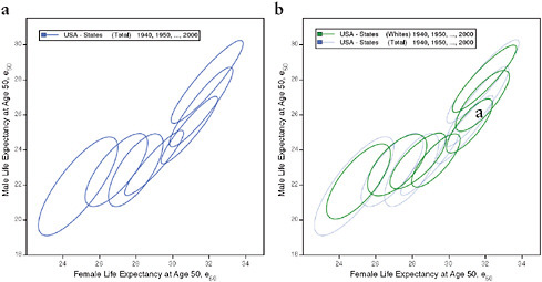
FIGURE 12-4 Changes in life expectancy at age 50 (e50) by sex, race, and state, United States 1940-2000.
(a) Total, by state
(b) Total and whites, by state
(c) Blacks and whites, by state
(d) Total, by state and county
NOTES: For each ellipse, the axes are aligned with the first and second principal components of the relationship between male and female life expectancy for a given population and year; the size is the minimum required in order to include at least 90 percent of the data points. See Annex B for technical details.
RESULTS
In this section we first describe trends in U.S. life expectancy at age 50 by sex and race as well as changes in the degree of geographic variation, at both state and county levels. We then describe changes in regional disparities among the other high-income countries in the study before presenting the results of our analysis relating changes in regional variability within countries to changes in variability between countries.
Geographic Disparities in the United States
The geographic variability of mortality levels at older ages in the United States has been and continues to be quite large. In 1950, the difference in e50 between the best- and the worst-ranking state was 4.5 years. By 2000, this value had declined only slightly, to 4.4 years.
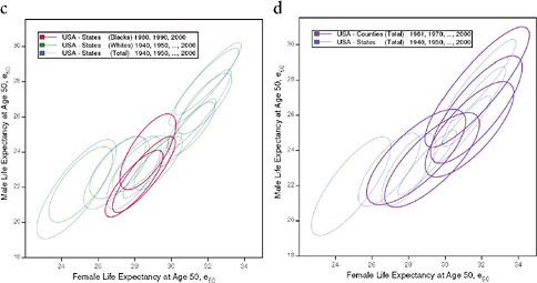
The series of ellipses based on state data for the total or white population refer to 3-year periods centered on 1940, 1950, … , 2000. The series based on state data for the black population refers to 3-year periods centered on 1980, … , 2000. The series based on county data refers to 5-year periods centered on 1961, 1970, … , 2000.
SOURCES: Authors’ analysis of data from various sources: for states from 1940 to 1990, National Center for Health Statistics and predecessors, state life table publications; for states in 2000, authors’ calculations based on data for 1999, 2000, and 2001, from the National Center for Health Statistics and the U.S. Census Bureau (from data files provided by Andrew Fenelon); for counties, Ezzati et al. (2008) (from updated data files provided by Sandeep Kulkarni).
These results for the total population mask the different experiences of men and women. Geographic disparities in mortality at older ages have been and continue to be larger for men than for women (with ranges of e50 equaling 5.5 versus 3.6 years in 1950 and 5.3 versus 4.3 years in 2000), even though women have a considerably longer length of life after age 50 than men. However, whereas the range of geographic variability for men has narrowed slightly, it has increased considerably for women, to the point that women in the worst-off counties of the United States now live fewer years, on average, after age 50 than men in the best-off counties. It is thus possible that the future range of geographic variability of life expectancy in the United States may become more similar for the two sexes.
For both men and women, the geographic pattern of disparity in e50 across states of the United States has remained relatively stable since 1950 (see Figure 12-3). In 1950 as in 2000, several states in the southeastern
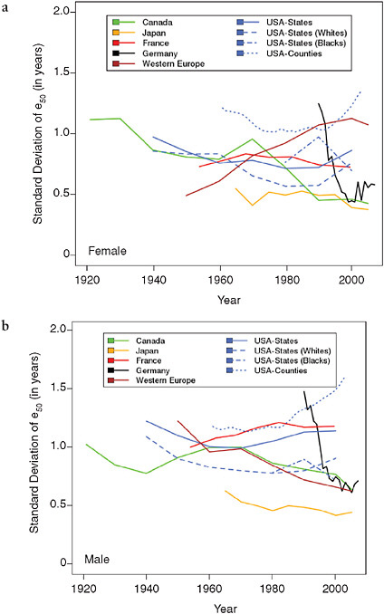
TABLE 12-3 Annual Rates of Change in Life Expectancy at Age 50 (e50), Plus Convergence Effects Due to Faster Change in Lower 50 Percent of Geographic Distribution, for Five Countries Plus Western Europe as a Whole, 1980-2000
quadrant of the country (including the District of Columbia), plus Nevada, have experienced relatively low values of life expectancy at age 50, whereas many states of the north central and mountain regions, plus Hawaii in 2000, have had greater longevity at older ages. Some state rankings appear implausible and may reflect flaws in the data, especially for earlier years.
TABLE 12-4 Differences in Rate of Increase of Life Expectancy at Age 50 (e50) Between the United States and Four Countries Plus Western Europe as a Whole, and Portions of Each Difference Due to Three Components, 1980-2000
|
Population |
Difference in Average Annual Change of e50from 1980 to 2000 |
|||
|
Total Difference (in years/annum) |
Portion of Difference (in %) due to: |
|||
|
Difference of Trends for Upper 50% (of geographic distributions) |
Divergence in the U.S. (between lower and upper 50%) |
Convergence in Comparison Area (between lower and upper 50%) |
||
|
Women |
|
|
|
|
|
Canada |
0.052 |
66.7 |
15.2 |
18.1 |
|
France |
0.113 |
90.7 |
7.1 |
2.3 |
|
Germany |
0.160 |
72.4 |
5.0 |
22.6 |
|
Japan |
0.192 |
94.2 |
4.2 |
1.6 |
|
Western Europe |
0.104 |
101.6 |
7.7 |
−9.3 |
|
Men |
|
|
|
|
|
Canada |
0.029 |
47.8 |
37.7 |
14.5 |
|
France |
0.039 |
60.6 |
27.6 |
11.8 |
|
Germany |
0.094 |
58.7 |
11.5 |
29.8 |
|
Japan |
0.009 |
−62.0 |
114.4 |
47.5 |
|
Western Europe |
0.033 |
55.0 |
33.0 |
12.1 |
|
NOTES: Using the column notation of Table 12-2, the partitioning of differential rates of change shown here can be expressed as follows: Comparison(a) − U.S.(a) = [ Comparison(b) − U.S.(b) ] − U.S.(d) + Comparison(d). Values of (a), (b), and (d) for the United States used in this calculation were the mean of state and county values, which differ slightly. Data for most countries or populations were available for periods centered on 1980 and 2000. The exceptions are France (from 1982 to 1999) and Germany (from 1990 to 2000). SOURCE: Authors’ calculations based on data from Table 12-3. |
||||
In particular, the favorable positions of Arkansas, Oklahoma, and Texas in 1950 seem inconsistent with the socioeconomic position of that region and are strongly contradicted by data from later years. Together with Nevada, these three states were the last to be admitted by the U.S. Census Bureau, then in charge of the vital statistics system, to the death registration area of the United States due to coverage issues (Hetzel, 1997). Admission was granted only when at least 90 percent of deaths were registered. Arkansas was admitted in 1927, Oklahoma in 1928, and Texas in 1933. It is possible that a significant proportion of unregistered deaths remained in the early 1950s, inducing artificially high levels of expectation of life at birth and at older ages in these states. The only major change of state rankings in e50 that seems plausible (i.e., not spurious due to changes in data quality) is the rising position of New Jersey, New York,
and Pennsylvania over the latter half of the 20th century. Our results at the state level are consistent with those at the county level of Ezzati and colleagues (2008), who also showed a pattern of regional stability over a somewhat shorter time interval.
Using ellipses to summarize scatter plots (see Methods section), Figure 12-4 illustrates the simultaneous rise of female and male e50 from 1940 to 2000 across states and counties of the United States. On average across all population subgroups, people who survived to age 50 were expected to live over 8 years longer in 2000 than in 1940, corresponding to an increase in e50 from 23 years in 1940 to 31.3 years in 2006, or an average rise of 1.3 years per decade. This increase was particularly rapid between 1940 and 1950 (+1.7 years) and between 1970 and 1980 (+1.8 years) and relatively slow between 1950 and 1970 (less than 1 year for each of the two decades, 1950-1960 and 1960-1970).
However, the pace as well as the timing of improvement varied by subgroup of the population. For example, when comparing men with women, it is apparent not only that women already lived longer than men after age 50 in 1940 (24.3 versus 21.6 years), but also that they have experienced a faster pace of improvement, with a gain of 8.6 versus 7.7 years between 1940 and 2006. Whereas for women most of the increase (70 percent) took place before 1980, for men most of it (60 percent) occurred between 1980 and 2006. Consequently, the sex gap in e50 was largest in the second half of the 1970s, when it exceeded 5.8 years compared with 2.8 years in 1940 and 3.8 years in 2006. This differential trend is well illustrated by Figure 12-4a, which shows an initial movement of the ellipses away from a diagonal line toward the right, followed by a later movement back toward the diagonal line. Variations by race are illustrated in Figures 12-4b and 12-4c; however, the information is limited by the fact that e50 is available for blacks only since 1980 and that similar information for other racial or ethnic groups is not currently available.
Figure 12-4d illustrates the changing values of female and male e50 by state and by county from 1940 until 2000. Since counties are both more homogeneous and far more numerous than states, it is not surprising that regional variations are larger at the county than at the state level, as illustrated here by the larger area covered by the series of ellipses representing the counties than by those representing the states (see also Figure 12-1).
Comparison with Other High-Income Countries
Figure 12-5 shows trends in the (weighted) standard deviation of e50 across geographic subunits in five countries, as well as among the countries of Western Europe, from 1921 to 2007. For the countries with available data, it appears that the level of regional variability in e50 fell somewhat dur-
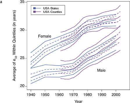
FIGURE 12-6 Trends in the average value of e50 within quintiles of state or county distributions, United States (total, white, and black populations), 1940-2003.
(a) Total, by state and county
(b) Blacks and whites, by state
SOURCES: Authors’ analysis of data from various sources: for states from 1940 to
ing the first half of the 20th century but then tended to stabilize or increase slightly after 1950. An exception is Germany, which experienced a sharp drop in the regional variability of e50 following reunification in 1990.
The figure also shows substantial differences in levels of geographic variability in e50 by population and by sex. For women (Figure 12-5a), Canada is the only population for which regional disparities have mostly declined over time, at least from 1921 to 1990, with only a short increase in the 1960s. By contrast, France and Japan exhibited a relatively stable level of internal disparity throughout the observation period (1954-1999 and 1965-2005, respectively), as did Germany beginning about 10 years after reunification. Western Europe as a whole shows a continuous and steep increase in regional variability attributable to the differential pace of growth in female life expectancy among the various countries. Women in the United States experienced a small but continuous decline in regional dis-
1990, National Center for Health Statistics and predecessors, state life table publications; for states in 2000, authors’ calculations based on data for 1999, 2000, and 2001, from the National Center for Health Statistics and the U.S. Census Bureau (from data files provided by Andrew Fenelon); for counties, Ezzati et al. (2008) (from updated data files provided by Sandeep Kulkarni).
parities (whether looking at states or counties) up to 1980 but a significant increase afterward, especially between 1990 and 2000.
For men (Figure 12-5b), the picture is quite different: variability declined everywhere between 1960 and 1980 and either continued its decline (in Canada, Western Europe as a whole, and Germany in particular) or remained stable (in Japan) between 1980 and 2000, except for France and the United States, where variability has increased since the 1950s and 1970s, respectively. For both men and women, Figure 12-5 suggests that trends in geographic variability may have been somewhat different by race during the last two decades of the 20th century. However, the meaning of such differences should not be exaggerated, as they could result at least partly from changes in racial classification over time.
Overall, geographic variability was greater in the United States than in other high-income countries during 1980-2000 but similar to levels of vari-
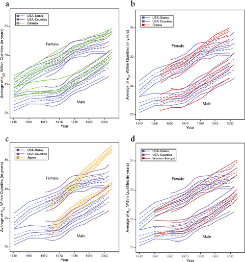
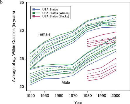
FIGURE 12-7 Trends in the average value of e50 within quintiles of geographic distributions, United States compared with Canada, France, Japan, and Western Europe, 1940-2005.
(a) United States and Canada
(b) United States and France
(c) United States and Japan
(d) United States and Western Europe
SOURCES: Authors’ analysis of data from various sources: for Canada, Canadian Human Mortality Database (see http://www.bdlc.umontreal.ca/CHMD [accessed March 2009]); for France, Daguet, 2006 (from data files provided by France Meslé and Jacques Vallin); for Japan, Ministry of Health, Labour, and Welfare, various years (from data files provided by Futoshi Ishii); for Western Europe, Human Mortality Database (see http://www.mortality.org [accessed July 2009]). See Annex A for further details.
ability across Western Europe as a whole, especially for women. Notably, the United States is the only population examined here for which geographic disparities increased over the last two decades of the 20th century for both men and women.
The Contribution of Increasing Geographic Variation to Deterioration of the U.S. Position in International Rankings
Table 12-3 presents the average change in e50 (in years per annum) for each population as a whole and for the upper and lower 50 percent of its geographic distribution between 1980 and 2000, as well as the value of the convergence effect (see the section on Methods), both in absolute level and as a fraction of the total change over this time period. The table shows that between 1980 and 2000 all areas in the study improved their level of e50 and that, except for Japan, men benefited more than women from the decline in mortality at older ages (Table 12-3, column (a)). Table 12-3 also shows that the United States exhibited the smallest progress in e50 compared with the other countries in the study. Although the intercountry gap was relatively small for men, it was quite sizeable for women, with average annual gains of less than 3 additional weeks of life in the United States compared with more than 1 month in Canada, nearly 2 months in Western Europe as a whole, 3 in Germany, and 4 in Japan. Male e50 increased by somewhat less than 2 months per calendar year in the United States, which is not far from the gains achieved in the other areas (with the exception of Germany, following reunification, which gained nearly 3 months per year on average during the 1990s).
More to the point, regional inequalities in longevity above age 50 increased in the United States for both men and women from 1980 to 2000 while declining everywhere else, except for women in Western Europe as a whole (Table 12-3, column (d)). Following the political reunification that occurred in 1990, Germany was especially successful in reducing regional disparities for both men and women; a more modest geographic convergence of e50 occurred in Canada, France, Germany, and Japan after 1980.
How much of the growing mortality disadvantage of the United States compared with other high-income countries can be explained by its growing geographic inequality? Figures 12-6 and 12-7 present our findings in a graphical way. Like Figure 12-5, Figure 12-6a shows that trends in regional variability in the United States are quite similar whether looking at states or at counties (even though the measured level of variability is, not surprisingly, greater when using smaller geographic units). Figure 12-6b shows that improvements in e50 for whites and blacks are similar though somewhat less favorable for white compared with black women.
The key point that emerges from a comparison of the data presented in Figures 12-6 and 12-7 is that the expectation of life at age 50 has exhibited
relatively unfavorable trends even in the most advantaged areas of the United States (whether states or counties) since 1980. A faster pace of increase for the various comparison populations has yielded geographic distributions of e50 that barely overlap in some cases. For example, the lowest quintile of life expectancy at age 50 for women across Japanese prefectures has been above the highest quintile for U.S. states continuously since the mid-1980s (see Figure 12-7c). For U.S. counties, the cross-over occurred a few years later (around 1990). Comparisons of U.S. trends with those for Canada, France, and Western Europe as a whole (Figures 12-7a, 12-7b, and 12-7d) yield a smaller though still noticeable pattern of temporal divergence for women; similar though less extreme patterns are observed for men.
Although the results of the analysis presented in Tables 12-3 and 12-4 vary somewhat depending on the choice of comparison area, some general findings apply in all instances. In particular, it is clear that increasing regional variability in the United States, combined with decreasing variability in all comparison populations (except women in Western Europe), contributed to a growing U.S. disadvantage in life expectancy at age 50 from 1980 to 2000. However, the share attributable to different patterns of geographic convergence or divergence differs strongly by sex. For men, for whom the differential increase during this period was modest, up to 50 percent is attributable to different trends in geographic disparities. (Note that the breakdown of the difference between the United States and Japan in Table 12-4 is essentially meaningless in the case of men due to the very small differential trend.) Divergence in the United States is the main driving force rather than convergence in the comparison area, except in Germany. Over 30 percent of the difference in the average annual change of e50 between the United States and Western Europe on one hand, Canada on the other, is attributable to increasing regional variability in the former and only 12 and 14 percent, respectively, to declining regional variability in the latter.
For women, the portion of differential increase due to trends in geographic variability is around 30 percent when comparing the United States with Canada or Germany but less than 10 percent when comparing the United States with France, Japan, or Western Europe as a whole. The latter comparisons seem more pertinent, since the German example is atypical because of reunification while the Canadian data are severely limited by the small number and uneven size of the geographic subunits. Thus, we conclude that the role of changing geographic variability for explaining differential trends in e50 is nonnegligible for both sexes though rather small in the case of women, for whom the largest differential trends are observed.
DISCUSSION
To summarize our main results, every population in our study experienced gains in e50 from 1980 to 2000 at a pace of at least half a year per de-
cade. In general, improvements in longevity during this period benefited men more than women, so that the gender gap has been progressively closing. The United States has made smaller progress than all the other populations with, for women, a gain of 1.1 years between 1980 and 2000 compared with 2.1 years in Canada, 3.2 in Western Europe, 3.4 in France, 4.3 in Germany, and 4.9 in Japan, and for men, a gain of 3.0 years compared with 3.5 years in Canada, 3.6 in Western Europe, 3.7 in France, 4.8 in Germany, and 3.1 in Japan. A substantial drop in the U.S. position in international rankings of e50 reflects this relatively slow improvement.
Our analysis has demonstrated that the slower progress achieved by the United States is partially due to its increasing regional variability compared with other high-income countries. Indeed, whereas internal disparities in the United States, whether measured at the state or at the county level, tended to decline up to the early 1980s, they have increased since then, in contrast to most other populations in the study (with the notable exception of women in Western Europe taken as a whole), which have experienced stability or an ongoing decline of geographic variability. For men, the difference of trends in regional disparities explains up to 50 percent of the relatively slower pace of increase in e50 for the United States compared with three of the four countries examined here (as noted earlier, this comparison is not meaningful in the case of Japan, since the pace of change in male e50 was nearly the same as in the United States over this time period). For women, however, rather little (under 10 percent in the most relevant cases) of the slow progress recorded by the United States in e50 compared with other countries can be attributed to differential trends in regional disparities. Indeed, the difference between the United States and the other countries in the number of years of life gained after age 50 over the last 20 years of the 20th century was not much different when comparing only the better-off 50 percent of each population than when comparing the worseoff 50 percent.
Thus, although the relatively less favorable trend in life expectancy at age 50 for the United States was due in part to increasing geographic disparities in the country during 1980-2000, combined with a general reduction of such disparities in the other countries examined, most of the slower pace of improvement must be attributed to policies, practices, and behaviors that are characteristic of the nation as a whole. This conclusion is consistent with the findings by Banks and colleagues (Banks et al., 2006), who showed that, even within similar income strata, the English are in much better health than their U.S. counterparts with regard to seven key health indicators (diabetes, hypertension, heart disease, myocardial infarctions, strokes, diseases of the lung, and cancer). These researchers also found that the gradient of mortality differentials by socioeconomic status (measured by years of education and household income) is substantial in both countries but steeper in the United States. They noted that neither individual behaviors, such as smok-
ing, alcohol consumption or diet, nor access to medical care, measured by whether respondents had health insurance, explained much of the difference between the two countries.
In conclusion, we think that this analysis helps to rule out an increase in geographic disparities as a dominant explanation for the deteriorating position of the United States in international rankings of life expectancy, especially for women. Any proposed explanation of the divergence in levels and trends of life expectancy observed among high-income countries in recent decades needs to acknowledge that even the most advantaged areas of the United States (at the state or county level) have been falling behind in international comparisons.
ACKNOWLEDGMENTS
This project received financial support from the National Institute on Aging, grants no. R01-AG011552 and 2P30AG012839, and from the Institut National d’Études Démographiques, INED research project no. P05-3-7.
REFERENCES
Antonovsky, A. (1967). Social class, life expectancy, and overall mortality. The Milbank Memorial Fund Quarterly, 45(2 pt. 1), 31-73.
Banks, J., Marmot, M., Oldfield, Z., and Smith, J.P. (2006). Disease and disadvantage in the United States and in England. Journal of the American Medical Association, 295(17), 2037-2045.
Canadian Human Mortality Database. Introduction. Department of Demography, Université de Montréal (Canada). Available http://www.demo.umontreal.ca/chmd/ [accessed March 2009].
Coale, A.J., and Treadway, R. (1986). A summary of the changing distribution of overall fertility, marital fertility, and the proportion married in the provinces of Europe. In A.J. Coale and S.C. Watkins (Eds.), The Decline of Fertility in Europe (pp. 31-181). Princeton, NJ: Princeton University Press.
Daguet, F. (2006). Espérance de vie à certains âges par département et région. Données de démographie régionale 1954-1999. Insee Résultats Société nº 49, décembre 2005.
Duleep, H.O. (1995). Mortality and income inequality among economically developed countries. Social Security Bulletin, 58(2), 34-50.
Edwards, R.D., and Tuljapurkar, S. (2005). Inequality in life spans and a new perspective on mortality convergence across industrialized countries. Population and Development Review, 31(4), 645-674.
Ezzati, M., Friedman, A.B., Kulkarni, S.C., and Murray, C.J.L. (2008). The reversal of fortunes: Trends in county mortality and cross-county mortality disparities in the United States. PloS Medicine, 5(4), 0557-0568.
Federal Statistical Office, Germany. Death Counts by Age and Year of Birth by Federal States (Table S09), various years.
Federal Statistical Office, Germany. Population as of 31st December by Age and Year of Year of Birth (Table B15), various years.
Hetzel, A.M. (1997). History and Organization of the Vital Statistics System. Hyattsville, MD: National Center for Health Statistics.
Human Mortality Database. Overview. University of California, Berkeley (USA), and Max Planck Institute for Demographic Research (Germany). Available: http://www.mortality.org/ or http://www.humanmortality.de/ [accessed June 2010].
MacDorman, M.F., and Mathews, M.S. (2008). Recent Trends in Infant Mortality in the United States. NCHS Data Brief 9.
Ministry of Health, Labour and Welfare (Japan). Prefectural Life Tables, various years.
National Center for Health Statistics. (1966). State Life Tables: 1959-1961. Vol. 2, Nos. 1-51. PHS Publication HRA 1252. Washington, DC: U.S. Department of Health, Education, and Welfare, Public Health Service. Available: http://www.cdc.gov/nchs/data/lifetables/life59_2_1-26.pdf or http://www.cdc.gov/nchs/data/lifetables/life59_2_27-51.pdf [accessed June 2010].
National Center for Health Statistics. (1975). State Life Tables: 1969-1971. Vol. II, Nos. 1-51. DHEW Publication HRA 75-1151-1. Rockville, MD: U.S. Department of Health, Education, and Welfare, Public Health Service. Available: http://www.cdc.gov/nchs/data/lifetables/life69_2_12-6.pdf or http://www.cdc.gov/nchs/data/lifetables/life69_2_27-51.pdf [accessed June 2010].
National Center for Health Statistics. (1986). U.S. Decennial Life Tables for 1979-1981. Vol. II, Nos. 1-51. DHHS Publication PHS 86-1151-1-1. Hyattsville, MD: U.S. Department of Health, Education, and Welfare, Public Health Service. Available: http://www.cdc.gov/nchs/products/life_tables.htm [accessed June 2010].
National Center for Health Statistics. (1998). U.S. Decennial Life Tables for 1989-1991. Vol. II, State Life Tables 1-51. DHHS Publication PHS-98-1151-1. Hyattsville, MD: U.S. Department of Health, Education, and Welfare, Public Health Service.
National Office of Vital Statistics. (1948). State and Regional Life Tables: 1939-41. Life Tables for the White Population of the United States, Each State, and Certain Groups of States, by Sex. Washington, DC: U.S. Federal Security Agency, Public Health Service. Available: http://www.cdc.gov/nchs/data/lifetables/life39-41.pdf [accessed June 2010].
National Office of Vital Statistics. (1956). State and Regional Life Tables: 1949-1951. Life Tables for the White Population of Each State, and for the Nonwhite Population of 16 Southern States and the District of Columbia. Vital Statistics-Special Reports Vol. 41, Supplement. Washington, DC: U.S. Department of Health, Education, and Welfare, Public Health Service. Available: http://www.cdc.gov/nchs/data/lifetables/life49-51_41supp.pdf [accessed June 2010].
Preston, S.H. (2007). The changing relation between mortality and level of economic development. International Journal of Epidemiology, 36(3), 484-490.
Preston, S.H., and Taubman, P. (1994). Socioeconomic differences in adult mortality and health status. In National Research Council, L.G. Martin and S.H. Preston (eds.), Committee on Population. Division of Behavioral and Social Sciences and Education. Demography of Aging (pp. 279-318). Washington, DC: National Academy Press.
Rodgers, G.B. (1979). Income and inequality as determinants of mortality: An international cross-section analysis. Population Studies, 33(2), 343-351.
Smith, J.P. (1999). Healthy bodies and thick wallets: the dual relation between health and economic status. Journal of Economic Perspectives, 13(2), 144-166.
Statistics Bureau (Japan), Ministry of Internal Affairs and Communications. Population Census of Japan, various years.
Wilmoth, J.R., and Horiuchi, S. (1999). Rectangularization revisited: Variability of age at death within human populations. Demography, 36(4), 475-495.
ANNEX 12A
DOCUMENTATION OF DATA SOURCES
All mortality data at the national level were obtained from the Human Mortality Database (see http://www.mortality.org [accessed July 26, 2009]). Regional data come from a variety of sources and present different issues depending on the country involved, as explained below.
United States
States
For 1940-1990, mortality statistics for the individual states of the United States and the District of Columbia come from the decennial life tables that are published each decade by the National Center for Health Statistics (NCHS 1966, 1975, 1986, 1998) and its predecessor, the National Office of Vital Statistics (NOVS 1948, 1956). The full series in PDF format is available at the Centers for Disease Control and Prevention/NCHS website, see http://www.cdc.gov. Only the recent 1989-1991 tables have been digitized by NCHS, and therefore we have keypunched the qx values (conditional probabilities of dying between ages x and x + 1) from the facsimiles and constructed life tables based on these probabilities.
Before 1960, the collection includes no tables for sexes combined. Therefore, we computed life tables for both sexes combined in 1940 and 1950 as a weighted average of sex-specific values, ![]() , where lx is the proportion surviving to age x. In addition, tables are lacking in this period for the total population with all races combined (indeed, for many states the only tables available refer to the white population). To impute values of e50 for the total U.S. population, we applied to the 1940 and 1950 data for whites an adjustment factor equal to the average ratio (by sex and state) of e50 for the total population to that of whites over all subsequent decades (1960 through 2000).
, where lx is the proportion surviving to age x. In addition, tables are lacking in this period for the total population with all races combined (indeed, for many states the only tables available refer to the white population). To impute values of e50 for the total U.S. population, we applied to the 1940 and 1950 data for whites an adjustment factor equal to the average ratio (by sex and state) of e50 for the total population to that of whites over all subsequent decades (1960 through 2000).
In the life tables for 1959-1961, data by race are available only for men and women separately. Therefore, as for the preceding decades, we computed weighted averages of sex-specific qx values to obtain race-specific life tables for both sexes combined. Life tables by state in this period are available for all races combined but only for men and women together. Since data by sex in this period are available for whites in all states, we computed sex-specific life tables for all races combined in this period by assuming that age-specific ratios of qx for the total versus white populations were the same by sex as for the sexes combined.
As of March 2010, NCHS had published a decennial life table for 1999-2001 for the country as a whole but had not yet released tables for the individual states. Andy Fenelon, at the University of Pennsylvania, provided us with death counts by state for the years 1999, 2000, and 2001 (from multiple cause of death data files available from NCHS) and matching state population counts from census tabulations in 2000. Following standard practice, the life tables for 1999-2001 used in this analysis were computed using deaths by place of residence.
Counties
Life expectancy at birth at the U.S. county level for 1961-1999 was obtained from the PloS supplemental website for the Ezzati and colleagues (2008) paper. These data include Federal Information Processing Standards (FIPS) county identifiers for 3,150 counties as well as a mapping of how these counties were merged for sampling reasons into 2,048 regions. Sandeep Kulkarni, one of the coauthors of the above paper, provided us with more detailed data through 2003, namely life expectancies by age (including age 50) and county-specific population counts. More information about the method of combining the least populous counties into larger aggregates is available in the original paper.
France
Data by department for France, centered on the years 1954, 1962, 1968, 1975, 1982, 1990, and 1999, were obtained from Daguet (2006). Population estimates by age and sex come from Table 1, and life expectancies by age (ex) from Table 3.5 of that publication. These data were given to us by France Meslé and Jacques Vallin of the Institut National d’Études Démographiques in Paris.
Germany
Death counts (Table S09) and population counts (Table B15) for 1990-2007 for the German States come from the Federal Statistical Office of Germany. Eva Kibele, of the Max Planck Institute for Demographic Research in Rostock, Germany, computed annual life tables for federal states using these underlying vital statistics and provided all life-table and population data for Germany used in this analysis.
Canada
Regional data for 10 Canadian provinces during 1921-2005 were obtained from the Canadian Human Mortality Database, (see http://www.bdlc.umontreal.ca/chmd [accessed March 2009]).
Japan
Spreadsheets with full life table data for 47 prefectures in 1995, 2000, and 2005 were provided by Futoshi Ishii of the National Institute of Population and Social Security Research in Japan. The data collection for 2005 includes retrospective information for key indicators (including life expectancy by sex at age 50) at 5-year intervals back to 1965. For 1995, we used the adjusted life tables that remove the effect of earthquake mortality in Hanshin/Kobe prefecture. The underlying source for the life tables is Ministry of Health, Labour and Welfare (various years). Population data for the prefectures come from the census (Statistics Bureau, Japan, various years).
ANNEX 12B
USE OF PRINCIPAL COMPONENTS FOR CREATING GRAPHICAL ELLIPSES
As illustrated here in Figures 12-3 and 12-4, male and female values of life expectancy at age 50 for a given time period have a strong positive correlation across states and counties of the United States An efficient means of characterizing the two-dimensional distribution of male-female values is to draw ellipses that contain most or all of the data points. A simple method for creating such ellipses in a different application was described by Coale and Treadway (1986). Here, we employ an alternative approach based on principal components analysis (PCA).
In words, we begin by centering the data points around their mean values, identifying their two principal axes and projecting the points onto the new basis (i.e., computing coordinates of the data points in relation to their principal axes), and then rescaling each point using standard deviations of projected abscissa and ordinate values. This series of calculations turns the original ellipsoidal scatterplot into a circular collection of points centered on the origin. To reduce the influence of outliers, we approximate the circular distribution while ignoring the outer 10 percent of data points; that is, we find a minimum radius r such that a circle with this radius (centered on the origin) contains 90 percent of the observed points. This centering, projecting, and scaling process is then reversed, so that the points on the circle with radius r are remapped (i.e., scaled, projected, and centered) so that they are comparable to the original values of male and female life expectancy, forming an ellipsoid that contains 90 percent of the data points.
In formulas, let x1 = (x11,x21, … , xn1)T and x2 = (x12,x22, … , xn2)T be column vectors containing male and female values of life expectancy at age 50 by state or country for a given year, and let x = (x1, x2) be an n by 2 matrix. Suppose that μ1 and μ2 are the mean values of x1 and x2, and let Y = (x1 − μ1, (μ1, x2), x2 − μ2) be an n by 2 matrix whose columns contain the recentered values of male and female life expectancy. The sample covariance matrix, ![]() , can be decomposed using PCA by invoking the spectral decomposition theorem (Mardia, Kent, and Bibby, 1979, pp. 213ff, 469):
, can be decomposed using PCA by invoking the spectral decomposition theorem (Mardia, Kent, and Bibby, 1979, pp. 213ff, 469): ![]() , where the columns of U = [u1, u2] comprise an orthonormal basis, and Λ = diag(λ1, λ2) is a diagonal matrix with positive elements λ1 > λ2 > 0. By computing
, where the columns of U = [u1, u2] comprise an orthonormal basis, and Λ = diag(λ1, λ2) is a diagonal matrix with positive elements λ1 > λ2 > 0. By computing ![]() , we project the original data points onto the span of u1 and u2 and simultaneously rescale
, we project the original data points onto the span of u1 and u2 and simultaneously rescale
them so that the variation along each axis is now unity: ![]() . Note that the matrix, Z, like X and Y previously, contains two column vectors, z1 = (z11,z21, … , zn1)T and z2 = (z12,z22, … , zn2)T, both of length n.
. Note that the matrix, Z, like X and Y previously, contains two column vectors, z1 = (z11,z21, … , zn1)T and z2 = (z12,z22, … , zn2)T, both of length n.
Let ![]() be a set of points that lie on a circle of radius r centered on the origin, and let Z = [z1, z2] be a ma-12 trix containing these points (the number of points is arbitrary and can be adjusted upward or downward to obtain any desired level of precision for drawing the circle or corresponding ellipse). We find the minimum radius r such that 90 percent of the transformed data points lie inside the circle. Computing
be a set of points that lie on a circle of radius r centered on the origin, and let Z = [z1, z2] be a ma-12 trix containing these points (the number of points is arbitrary and can be adjusted upward or downward to obtain any desired level of precision for drawing the circle or corresponding ellipse). We find the minimum radius r such that 90 percent of the transformed data points lie inside the circle. Computing ![]() and X = (y1 + μ1, y2+ μ2), where y1 and y2 are the columns of Y, each point in the circle is mapped back onto the original basis. The points corresponding to rows of X form an ellipse that encloses 90 percent of the original data points.
and X = (y1 + μ1, y2+ μ2), where y1 and y2 are the columns of Y, each point in the circle is mapped back onto the original basis. The points corresponding to rows of X form an ellipse that encloses 90 percent of the original data points.


