
Appendix B
Critique and Suggestions Regarding Current Water Quality Trend Reporting Approaches
The Committee identified a set of issues with the types of displays and discussion used by the New York City Department of Environmental Protection (NYC DEP) in conjunction with reports based on their monitoring data. The Committee suggests three underlying changes in analysis and reporting conventions that will greatly improve the value of the excellent monitoring data that NYC DEP has collected:
- Graphics should generally show the longest-possible time series of annual statistics (e.g., annual mean concentrations, annual minimum values, or annual constituent fluxes)
- Formal statistical models should be applied to each of the data series that is collected, and these models should be the basis for inferences about spatial or temporal trends.
- Boxplots should be widely used for comparisons across many sites or across many seasons or before and after some management change, but they should not be used to describe temporal trends.
The following examples, all from the 2017 Watershed Water Quality Monitoring Report (NYC DEP, 2018), provide a basis for illustrating some of the changes in approaches that NYC DEP should consider.
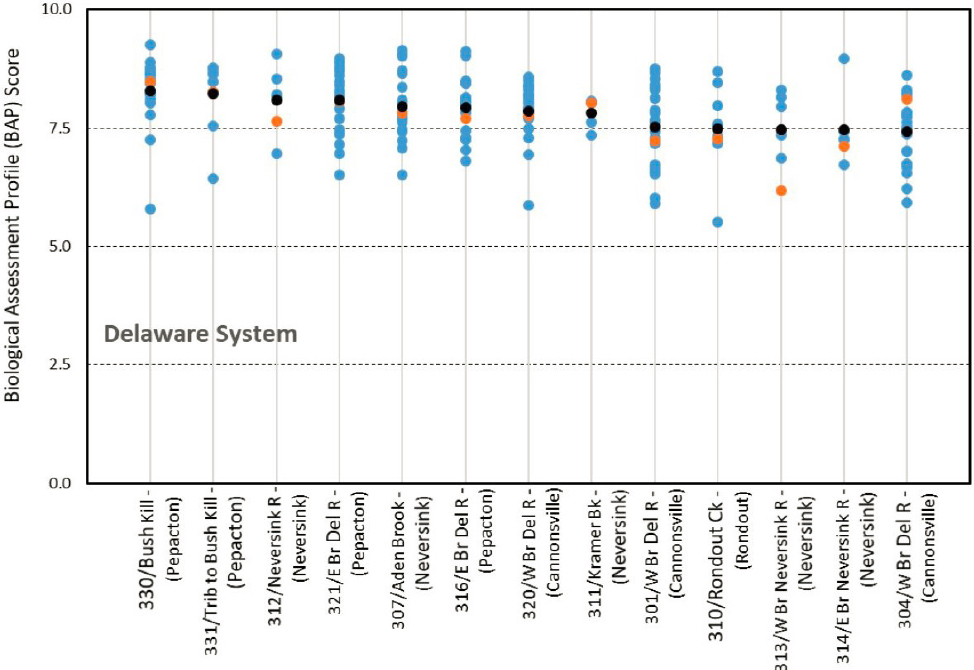
Figure B-1 shows Biological Assessment Profile scores in a manner that shows spatial differences but provides a very limited depiction of temporal trend. The data are scores from a biomonitoring sampling program based on benthic organisms in streams. A score of 10 is the best possible score and 0 is the worst. The most recent year is shown with the orange dot and all other years that have been sampled are in blue. The mean value over the period of record is shown in black. If one takes site 313 on the Neversink River (third site from the right edge) what one sees is that 2017 had the lowest score in the history of sampling at this site. That result may be a cause for some concern, but the manner in which the data are presented makes it difficult to determine if concern is appropriate. Does this data set suggest a progressive downward trend in ecological condition or is 2017 a single year that happens to be somewhat extreme? The same data could be shown in a manner that sheds much more light on the question. If the observations were arranged graphically in chronological order (time on the horizontal axis and score on the vertical axis) one could see if this 2017 value is part of an overall downward trend versus the possibility that the historical values are more nearly random and 2017 simply seems to be the lowest on record but not a part of a general pattern of decline. Such a graphical presentation could be made with each of the sites shown on the same time axis, with the vertical scale repeated for each of the sites. It appears that this data set for this site consists of only six observations, and as such, would probably not yield a strong statistical inference of trend, but even a purely graphical approach would be suggestive to the reader of a progressively worsening situation, if that were in fact the case. Some of the other sites on this graph appear to have as many as 15 observations. These could be subjected to a formal statistical test, such as the Mann-Kendall (Mann, 1945) test, but in many respects the graphical depiction is probably the most valuable output for this relatively simple data set.
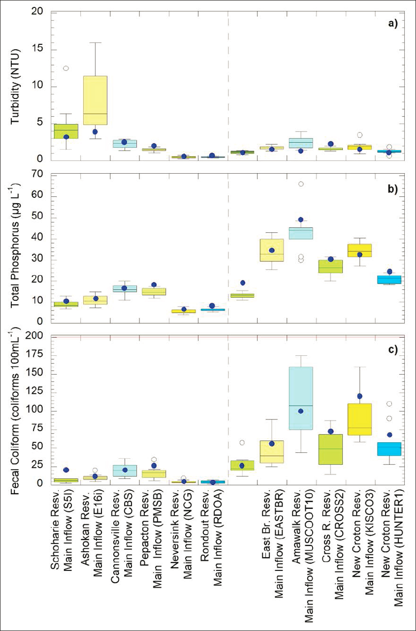
Another example of a similar presentation of data across multiple sites is shown in Figure B-2. This presentation of stream monitoring results has some particular advantages in that the boxplots enable the reader to quickly grasp what portions of the watershed have relatively high values and which have low values. For example, with total phosphorus (TP), one can see that generally the east-of-Hudson (EOH) streams have concentrations that are a good deal higher than those in west-of-Hudson (WOH) streams. One can also see that in the WOH streams the inflows to Cannonsville and Pepacton reservoirs are clearly the highest, inflows to Neversink and Rondout reservoirs are the lowest, and inflows to Schoharie and Ashokan reservoirs are intermediate between the two. The use of boxplots here is an appropriate way to show these broad spatial differences. It is tempting to take the most recent values as indicative of a trend. For example, the total phosphorus (TP) value for 2017 for Pepacton inflow was the highest value in the record. Here again it begs the question, is this indicative of some general progression from lower values to higher values, or is this simply a single high year in record that looks fairly random? A time-series plot and associated trend analysis would provide a much more meaningful depiction of these data. The Committee would urge NYC DEP to place less emphasis on the most recent annual value and more emphasis on the long-term temporal pattern of the data.
Another example from the 2017 Watershed Water Quality Monitoring Report shows a short-term and subjective perspective in interpretations. Figure B-3 has the advantage that it does show a long time series of data. The accompanying figure title, however, fails to use any formal statistical analysis and rather makes a subjective statement based on the last few observations. That is, the statement about an improvement seems to be focused
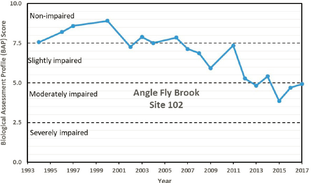
on the fact that the score increased from 2015 to 2017. However, the overall pattern from 1994 to 2017 is one of general decrease. It raises the question, What is the definition of trend? Most statistically minded scientists would use a method such as linear regression or a Mann-Kendall trend test over a period of a decade or more to evaluate a trend. Time-series graphics such as this one are appropriate, but it should be accompanied by a presentation of statistical trend results (e.g., a slope and significance level or confidence interval on the trend slope) rather than commenting on a few years of data at the end of the time series.
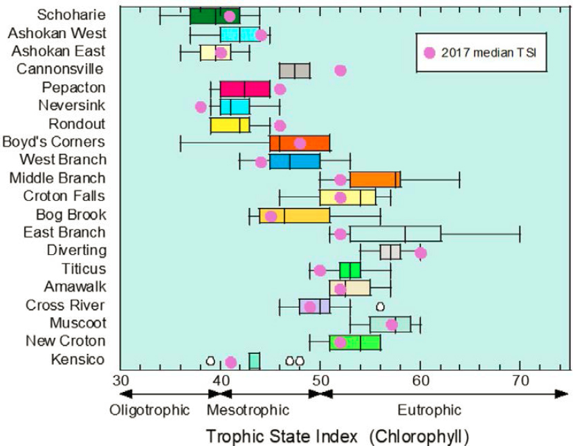
The 2017 Watershed Water Quality Monitoring Report attempts to convey information about relative levels of trophic state and some indication of trend in all 20 reservoirs in a single figure (see Figure B-4). It does that through a boxplot of the annual median Trophic State Index (TSI) and a single point indicating the TSI for 2017.
An alternative approach would be to use the boxplot to indicate the range of values over some period (such as the past ten years) and then use a color code for the box indicating if a trend test gives a result of a significant upwards trend (e.g., make those boxes be shown in red), significant downward trends (e.g., make those boxes be shown in blue) and no strong evidence of trend (e.g., shown in white). This particular graphic speaks to one of the most important watershed protection issues that NYC DEP faces. Are there widespread trends toward more eutrophic conditions in the reservoirs? Figure B-4 shows a TSI for Cannonsville in 2017 of approximately 52, and a range of values from 2007 to 2016 of 46 to 49. Given the microcystin data for Cannonsville Reservoir presented in Chapter 4 of this report, these TSI data deserve more attention. The particular way that the results are displayed makes it impossible to determine if the prior years exhibited a strong upwards trend, which the 2017 result simply continues, or if they are more nearly random and the 2017 value is just an outlier. Placing these annual results in the context of possible multiyear trends and attempting to build simple
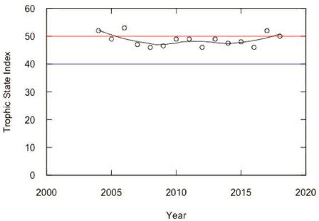
statistical models relating the behavior of the variable of interest (e.g., TSI) to a simple driving variable (e.g., streamflow or rainfall) could help place this single year in context. One graphical approach to displaying the TSI data is presented in Figure B-5 for the Cannonsville Reservoir using the full record of data that NYC DEP provided to the Committee (2004-2018).
What Figure B-5 suggests is that in the early part of this record, shortly after the completion of the wastewater treatment plant (WWTP) upgrades, the TSI was largely in the eutrophic range. Then for several years it seems to have improved and tended to stay in the mesotrophic range, but in the last two years of the record, it appears to have crept back into the eutrophic range. This display of the data conveys the pattern much better than Figure B-4 (NYC DEP, 2018; Fig. 3.6), indicating that there should be some cause for concern. One can also run a regression analysis to make this a more formal trend test. That analysis would need to start with a decision about what year to start the analysis. Given the major change that took place with completion of the WWTP upgrades it seems reasonable to consider a trend period of the 11 years from 2008 to 2018. A linear regression over these years indicates an upward trend of 0.3 TSI units per year and a two-sided p-value of 0.112. One way to view those results is to say “it is not statistically significant at alpha = 0.1 so one can ignore it.” A better approach is to say that there is moderately strong evidence that the trend is upwards and one can further quantify it by saying that the likelihood that that the trend is truly upwards is 0.944 and the likelihood that the trend is truly downwards is 0.056 (see McBride, 2019 for a discussion of this approach to reporting test results). This is a rather strong indication that eutrophication is increasing over time and presents sufficient evidence that current efforts are not leading to a solution of the eutrophication issue. This indication of trend needs to be communicated in graphical form and in reports.
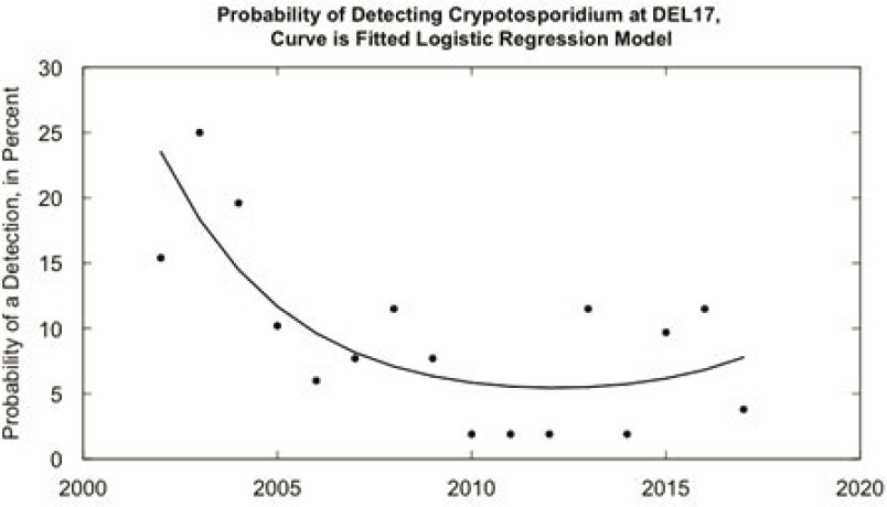
A final example in which the full potential of the existing data sets is not captured by the NYC DEP analysis is Table B-1 (Table 5.2 from NYC DEP, 2018, reproduced in Figure B-6) of results from Cryptosporidium detections over a 16-year period. Looking at the DEL17 data, one sees numbers that are somewhat suggestive of a declining frequency of detections over this period (seen when looking at the % Detects column). Tables of numbers are a poor way to provide an overview of how the system may be changing over time. A graph of those data would be helpful, but one could also run a formal statistical analysis to see if there truly was a decline that is greater than what one might find in a trend-free random process. Figure B-6 is an example of the kind of presentation that could be made. It shows the percent of samples in each year with detectable Cryptosporidium, and it also shows the results of a logistic regression model (Hosmer et al., 2013) on these data. The logistic regression estimates the log odds (i.e., the logarithm of the ratio of the probability of detecting to the probability of not detecting Cryptosporidium) as a quadratic function of the year. The results show that there is a statistically significant relationship. In other words, there is strong evidence of an overall trend and that trend was downwards from the start of this data set in 2002 until about 2013, but it has been rising slightly since that time. In terms of communicating success about reducing the risk of Cryptosporidium contamination, this analysis shows that there has been considerable improvement (risks falling from nearly 25 percent to about 5 percent) but with some indication that the risks may be rising more recently. Repeating this kind of graphical and statistical analysis annually would be a good approach for NYC DEP to communicate with their stakeholders.
In summary, the Committee recommends that in future water quality reports annual values should be depicted as time series. If the data span a period of a decade or more, NYC DEP should be using formal methods of trend analysis to estimate the slope of the trend and gain some measure of uncertainty about the trend.
REFERENCES
Hosmer, Jr, D. W., S. Lemeshow, and R. X. Sturdivant. 2013. Applied Logistic Regression, 3rd Edition. John Wiley & Sons.
Mann, H. B. 1945. Nonparametric test against trend. Econometrica 13(3):245–259. https://doi.org/10.2307/1907187.
McBride, G. B. 2019. Has water quality improved or been maintained? A quantitative assessment procedure. Journal of Environmental Quality 48(2):412-420. https://doi.org/10.2134/jeq2018.03.0101.
NYC DEP (New York City Department of Environmental Protecdtion). 2018. 2017 Watershed Water Quality Monitoring Report. July.
TABLE B-1 Annual Sample Detection and Mean Oocyst Concentration of Cryptosporidium at Inflow Keypoints to Kensico Reservoir 2002-2017.
| Site | CATALUM | DEL17 | ||||
|---|---|---|---|---|---|---|
| Year | Detects | % Detects | Mean (50L-1) | Detects | % Detects | Mean (50L-1) |
| 2002 | 6 | 11.5 | 0.17 | 8 | 15.4 | 0.15 |
| 2003 | 8 | 15.4 | 0.25 | 15 | 25.0 | 0.28 |
| 2004 | 10 | 19.2 | 0.29 | 11 | 19.6 | 0.10 |
| 2005 | 1 | 1.7 | 0.02 | 6 | 10.2 | 0.40 |
| 2006 | 3 | 5.8 | 0.06 | 3 | 6.0 | 0.06 |
| 2007 | 1 | 1.9 | 0.02 | 4 | 7.7 | 0.08 |
| 2008 | 7 | 13.5 | 0.13 | 6 | 11.5 | 0.15 |
| 2009 | 7 | 13.5 | 0.15 | 4 | 7.7 | 0.08 |
| 2010 | 1 | 1.9 | 0.04 | 1 | 1.9 | 0.02 |
| 2011 | 0 | 0.0 | 0.00 | 1 | 1.9 | 0.02 |
| 2012 | 0 | 0.0 | 0.00 | 1 | 1.9 | 0.02 |
| 2013 | 1 | 1.9 | 0.02 | 6 | 11.5 | 0.12 |
| 2014 | 2 | 3.9 | 0.04 | 1 | 1.9 | 0.02 |
| 2015 | 6 | 11.6 | 0.15 | 5 | 9.7 | 0.12 |
| 2016 | 7 | 13.5 | 0.17 | 6 | 11.5 | 0.17 |
| 2017 | 1 | 1.9 | 0.02 | 2 | 3.8 | 0.04 |
SOURCE: NYC DEP (2018).
This page intentionally left blank.


