


Below is the uncorrected machine-read text of this chapter, intended to provide our own search engines and external engines with highly rich, chapter-representative searchable text of each book. Because it is UNCORRECTED material, please consider the following text as a useful but insufficient proxy for the authoritative book pages.
1 This Guide is intended to help transportation planners create modern data visualizations. It is built for planners who want to learn the basics and peek around the corner at what is next once they have them mastered. It includes advice and best practices for developing visualization skills, enhancing transportation analysis, and improving public engagement. It considers advances in technology and communication, such as online tools, software, and technical support acquisition. The Guide is available in a website format at http://vizguide.camsys.com; it focuses on key takeaways and examples. 1.1 · Visualization in Transportation Why is it important? A visualization is any illustration that conveys information. It can be static, animated, or interactive, colorful or monochrome. It can represent a conceptual framework (e.g., an organizational structure), a dataset (e.g., census demographics), or a simple idea (e.g., the budget is really big). As societyâs ability to collect, store, and consume data has grown over time, so has the need to illustrate and explain that information, and visualizations often can do so more succinctly, engagingly, and quickly than can spreadsheets and narrative alone. At the turn of the 21 st Century, the term âvisualizationâ in the transportation industry almost always referred to static or animated renderings of improvement projects, often animated and three-dimensional (as illustrated in Figure 1). As the last decade ended, the proliferation of free public data from transit agencies, among others, changed the popular conception. Visualizations became more interactive and migrated online and into smartphone apps. Simultaneously, business-oriented visualization tools have provided practitioners with more sophisticated options for illustrating and communicating information. Organizations such as state transportation agencies (DOTs) and Metropolitan Planning Organizations (MPOs) have an opportunity to place more data than ever in front of stakeholders and the public. For these audiences, visualizations can inform, can spur an action, and can improve decision-making. In some cases, these organizations can engage the time and skills of app developers, hobbyists, and academic researchers to display complex open datasets. For example, after the Massachusetts Bay Transportation Authority (MBTA) released time-bound subway location data, graduate students Michael Barry and Brian Card produced âVisualizing MBTA Data,â shown in Figure 2. Figure 2: Screen Capture from âVisualizing MBTA Dataâ (by Michael Barry and Brian Card) http://mbtaviz.github.io/ In addition to these interactive solutions, many visualizations are static â a pie chart, bar graph, or pictogram integrated into printed text, for example. While there is no limit to the types of transportation information that can be conveyed visually, uses might include: ï· Bridge deterioration over time; ï· Ridership or occupancy over time for a transit service; ï· Volume over time for a roadway or intersection; ï· Benefits of a project compared with costs; Text intentionally left small to focus the reader on the overall image.
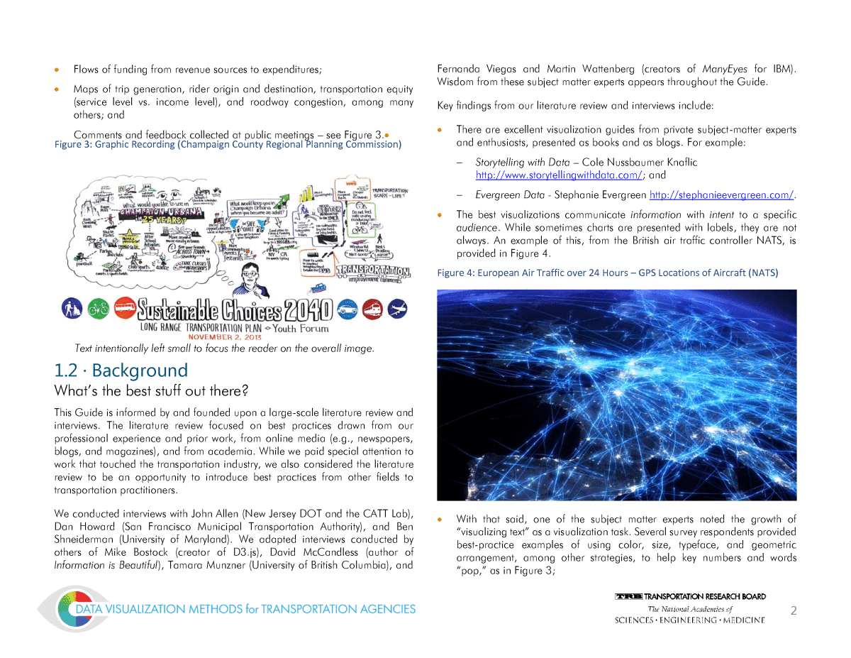
2 ï· Flows of funding from revenue sources to expenditures; ï· Maps of trip generation, rider origin and destination, transportation equity (service level vs. income level), and roadway congestion, among many others; and Comments and feedback collected at public meetings â see Figure 3.⢠Figure 3: Graphic Recording (Champaign County Regional Planning Commission) 1.2 · Background Whatâs the best stuff out there? This Guide is informed by and founded upon a large-scale literature review and interviews. The literature review focused on best practices drawn from our professional experience and prior work, from online media (e.g., newspapers, blogs, and magazines), and from academia. While we paid special attention to work that touched the transportation industry, we also considered the literature review to be an opportunity to introduce best practices from other fields to transportation practitioners. We conducted interviews with John Allen (New Jersey DOT and the CATT Lab), Dan Howard (San Francisco Municipal Transportation Authority), and Ben Shneiderman (University of Maryland). We adapted interviews conducted by others of Mike Bostock (creator of D3.js), David McCandless (author of Information is Beautiful), Tamara Munzner (University of British Columbia), and Fernanda Viegas and Martin Wattenberg (creators of ManyEyes for IBM). Wisdom from these subject matter experts appears throughout the Guide. Key findings from our literature review and interviews include: ï· There are excellent visualization guides from private subject-matter experts and enthusiasts, presented as books and as blogs. For example: ï Storytelling with Data â Cole Nussbaumer Knaflic http://www.storytellingwithdata.com/; and ï Evergreen Data - Stephanie Evergreen http://stephanieevergreen.com/. ï· The best visualizations communicate information with intent to a specific audience. While sometimes charts are presented with labels, they are not always. An example of this, from the British air traffic controller NATS, is provided in Figure 4. Figure 4: European Air Traffic over 24 Hours â GPS Locations of Aircraft (NATS) ï· With that said, one of the subject matter experts noted the growth of âvisualizing textâ as a visualization task. Several survey respondents provided best-practice examples of using color, size, typeface, and geometric arrangement, among other strategies, to help key numbers and words âpop,â as in Figure 3; Text intentionally left small to focus the reader on the overall image.
3 ï· There are many tools and types of tools for building best-practice visualizations, each with a different learning curve. Common programs like Microsoft Excel can create effective charts. A new class of Business Intelligence (BI) tools including Tableau, Qlik, and Microsoftâs PowerBI brings sophisticated visualization power to experts and casual users alike. Beyond these user-friendly tools, users with software programming capabilities can obtain several free and open-source tools such as D3.js to create interactive, web-based, data-driven visualizations; and ï· All subject-matter experts and best practices embrace simplicity as a driving principle. One interviewee, Dan Howard, noted that: âIf itâs too complex for you to explain [to the lay reader], thatâs a signal that youâre in trouble.â 1.3 · Audience for the Guide How do agencies visualize today? To ensure that this Guide would be as helpful as possible for practitioners, we conducted a survey of prospective users. Our objectives included: ï· Understanding who within transportation organizations possesses visualization and data management skills and who builds visualizations; ï· Exploring the level of visualization expertise in transportation agencies; ï· Assessing the degree to which transportation organizations deploy visualization methods and tools; and ï· Collecting a sample set of self-identified best-practice visualizations from the transportation industry and identifying trends and common approaches. We asked respondents to identify the two âbestâ visualizations published by their organizations. We asked them to reflect on the development, objectives, and outcomes of each. Thirty respondents completed the survey, from organizations shown in Figure 5. Figure 5: Organizations that Responded to the Visualization Survey for Transportation Practitioners (not pictured: Hawaii Office of Planning) Based on their responses, we conclude that our typical respondents: ï· Are mid-level managers or technical specialists for State agencies, MPOs, or universities in the fields of Transportation Planning, Highway Operations, and City Planning; ï· Present infographics or interactive online visualizations as their best visualization examples; ï· Most often use bar/column charts, colored maps, stacked area graphs, and pictograms;
4 ï· Construct visualizations using ArcGIS, Microsoft Office, Adobe InDesign, and JavaScript; ï· Design visualizations primarily for non-technical audiences (lay people, executives, and legislators); ï· Use several common datasets (e.g., Highway Performance Monitoring System (HPMS), National Bridge Inventory (NBI), and American Community Survey (ACS)); ï· Work for MPOs who produce visualizations for unique audiences, including municipal planners, officials and technical advisory panels; ï· Are confident in their in-house visualization skills, but they consider hiring consulting help for some visualization tasks; and ï· Have strong data management skills but lack institutional resources, software/data experience, and high-quality data. This Guide is intended to be useful to those organizations that frequently practice visualization and want to understand how to advance their practice toward the best practice but also to those that are just learning how to produce modern visualizations. 1.4 · Definitions In addition to defining a visualization as an illustration that conveys information, we use the following terminology throughout this Guide: ï· A chart or chart type is the data-driven arrangement of information on the page. Charts need not include axes, lines, or bars, though these are all elements of some types of charts. A word cloud, for example, will be treated as a chart type though it does not encode information through position; ï· A dimension is an âattributeâ of data (e.g., a column in a table) shown as a variation in the appearance of data points. Torsten Moller and Tamara Munzner refer to these as âchannels.â (Visualization Analysis and Design, 2014); and ï· A tool is a resource or software package used to build and publish visualizations. 1.5 · Outline We designed this Guide so that practitioners can reference the portions they need when they need them. Practitioners also can find targeted summaries of this material at vizguide.camsys.com. We have divided this Guide into five chapters, the first is this introduction. The other four include: ï· Chapter 2 · How to Illustrate Data: This chapter describes the most common chart types for transportation professionals, including types of data, chart variations, tips, and tools for production. The chapter also describes some less-common but useful alternatives. It draws on available comprehensive taxonomies of charts (e.g., Emeryâs Essentials). ï· Chapter 3 · Developing Effective Visualizations: This chapter describes a five-step process for translating data into an effective visualization: ï Data wrangling; ï Intent and audience; ï Analysis; ï Choosing a strategy; ï Tools and implementation (i.e., selecting the right tool and learning to use it). The chapter will describe each of these steps and best practices for addressing it. ï· Chapter 4 · Style Guide: This chapter provides basic design best practices that you can apply to your visualizations. ï· Chapter 5 · Conclusion: This chapter summarizes the Guide and offers advice and inspiration from visualization experts.
