


Below is the uncorrected machine-read text of this chapter, intended to provide our own search engines and external engines with highly rich, chapter-representative searchable text of each book. Because it is UNCORRECTED material, please consider the following text as a useful but insufficient proxy for the authoritative book pages.
106 Examples of Data Visualizations A P P E N D I X G As described in Chapter 5, there are many options for visualizing data collected as part of a QOL assessment and presenting it for interpretation, analysis, and decision-making purposes. To demonstrate some possibilities, qualitative data was gathered voluntarily from research team members living within the service area of a large international airport, and quantitative data was obtained from publicly available data sets covering the same spatial area. Research team members in this area provided qualitative information via an online version of the Quality of Life Assessment Survey Tool (Appendix A). These participants are not a representative sample of the population residing in the airport service area and the data were not collected from them with the goal of evaluating QOL for the full community surrounding the airport. Rather, these data were simply gathered so that the research team could develop example quadrant plots. The remainder of this section presents a brief overview of the data, the demographics of the participants, and a series of example quadrant plots. Data Collection The Quality of Life Assessment Survey Tool (Appendix A) was entered into an online survey tool to facilitate data collection from voluntary research team members. Thirty-two individuals from the research team completed the survey, responding to each of the qualitative indicator questions, as well as ranking the importance of each qualitative and quantitative indicator to their QOL or the QOL of their community. They also responded to the demographic questions included in the survey as optional (e.g., age, income, and education). Participants were instructed to skip any question that they did not want to answer, though most participants responded to all questions (however, participants did not enter their names, so the individual responses were not attributed to specific members of the research team). Once the data were collected, participant responses were converted to QOL scores and then averaged for each qualitative indicator. Average importance scores for all indicators were also calculated. The research team also compiled publicly available data for each of the quantitative indicators. In general, quantitative data were compiled at the scale that aligned with the service area of the airport, when possible, and at regional scales when the team judged that the data would still reflect conditions within the service area and no finer scale was available. As noted in the guidebook, there must be some flexibility in determining the appropriate scale of analysis on a case-by-case basis. For some indicators, data were gathered for the large city being evaluated. For other indicators, data were gathered at a finer G.1
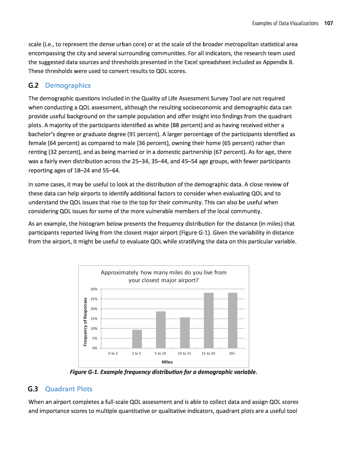
Examples of Data Visualizations 107 Demographics The demographic questions included in the Quality of Life Assessment Survey Tool are not required when conducting a QOL assessment, although the resulting socioeconomic and demographic data can provide useful background on the sample population and offer insight into findings from the quadrant plots. A majority of the participants identified as white (88 percent) and as having received either a bachelorâs degree or graduate degree (91 percent). A larger percentage of the participants identified as female (64 percent) as compared to male (36 percent), owning their home (65 percent) rather than renting (32 percent), and as being married or in a domestic partnership (67 percent). As for age, there was a fairly even distribution across the 25â34, 35â44, and 45â54 age groups, with fewer participants reporting ages of 18â24 and 55â64. In some cases, it may be useful to look at the distribution of the demographic data. A close review of these data can help airports to identify additional factors to consider when evaluating QOL and to understand the QOL issues that rise to the top for their community. This can also be useful when considering QOL issues for some of the more vulnerable members of the local community. As an example, the histogram below presents the frequency distribution for the distance (in miles) that participants reported living from the closest major airport (Figure G-1). Given the variability in distance from the airport, it might be useful to evaluate QOL while stratifying the data on this particular variable. Figure G-1. Example frequency distribution for a demographic variable. Quadrant Plots When an airport completes a full-scale QOL assessment and is able to collect data and assign QOL scores and importance scores to multiple quantitative or qualitative indicators, quadrant plots are a useful tool 0 to 2 2 to 5 5 to 10 10 to 15 15 to 20 20+ 0% 5% 10% 15% 20% 25% 30% Miles Fr eq ue nc y of R es po ns es Approximately how many miles do you live from your closest major airport? scale (i.e., to represent the dense urban core) or at the scale of the broader metropolitan statistical area encompassing the city and several surrounding communities. For all indicators, the research team used the suggested data sources and thresholds presented in the Excel spreadsheet included as Appendix B. These thresholds were used to convert results to QOL scores. G.2 G.3
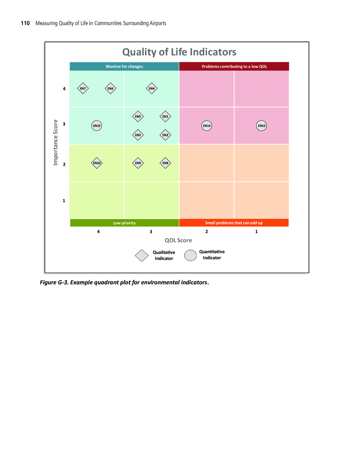
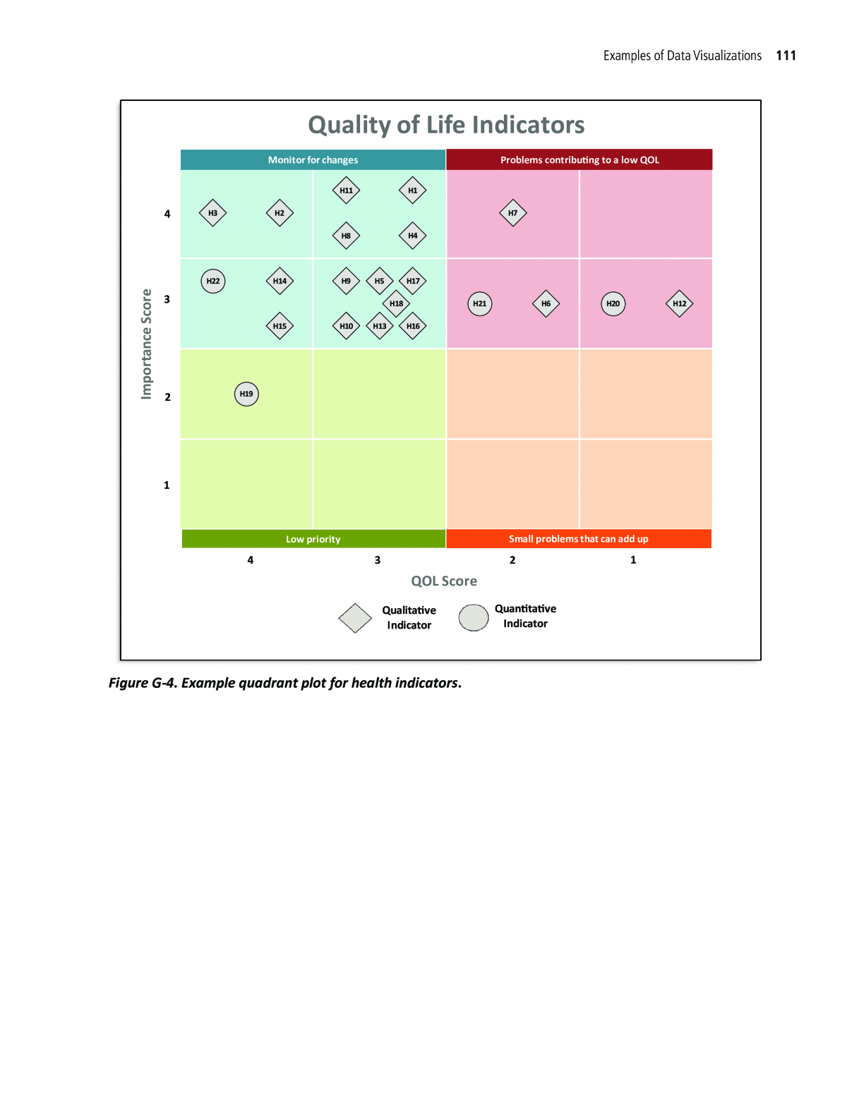
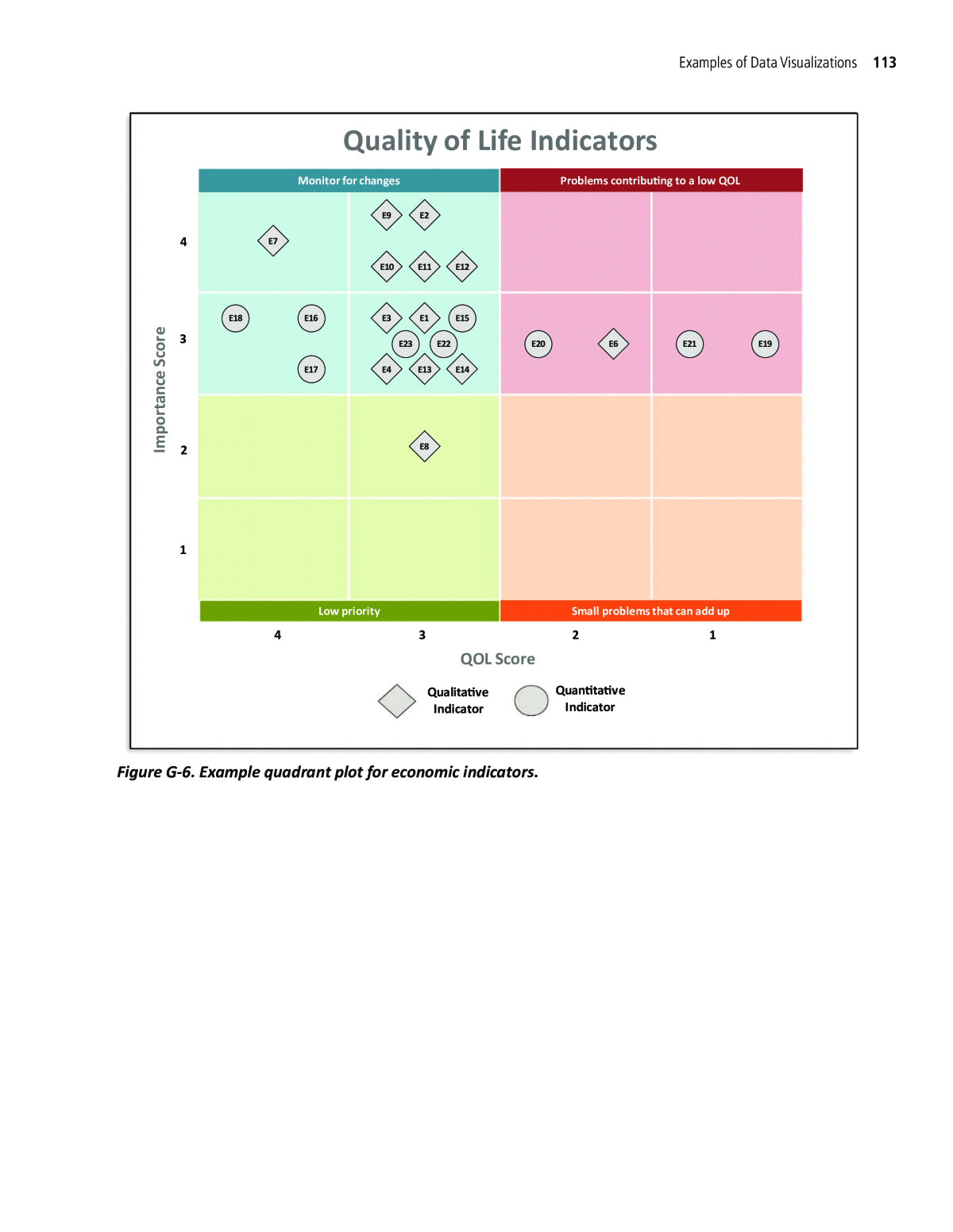
108 Measuring Quality of Life in Communities Surrounding Airports priority, which issues should be monitored for changes, which are low priority, and which are smaller issues that mayâif numerous and affecting the same livesâresult in aggregate lower QOL for community residents. Quadrant plots can be developed for a single member of the community or for the entire community. When results are presented for a community, QOL scores and importance scores must first be averaged. This can be done using simple averages (as described in Chapter 5 and used for this example). Alternatively, more complex approaches can be used to compensate for the phenomenon, whereby averaging artificially increases the number of mid-ranged scores (i.e., 2s and 3s) in the final results. One more complex approach to averaging involves weighting more heavily the 1s and 4s among the QOL scores being averaged, such that the extremes of very low or very high QOL (or importance scores) will be reflected in the final results (as noted in Appendix D). Regardless of the approach, there are many options for displaying these data and airports may consider multiple presentations, depending on their interests and needs. Examples of ways to explore QOL indicators with quadrant plots include, but are not limited to: Presenting results for all the indicators, either showing each indicator on the plot or showing the total count of indicators that appear in each quadrant by category; Presenting only qualitative indicators or only quantitative indicators; Presenting indicators for a specific category (e.g., transportation, environment, and health); and Presenting indicators for a subset of the sample population (e.g., a certain neighborhood or community, a vulnerable population, or those who live closest to the airport). In addition to the quadrant charts, airports might be interested in viewing the distribution of QOL scores or importance scores for the sample population. Because these scores are averaged across participants, there may be cases in which it is worthwhile to evaluate the data more closely to ensure that the averaging approach being used is not diluting any potentially important indicators associated with a low QOL. This exercise can also be done considering variations in demographic, socioeconomic, or geographic variables (e.g., race or ethnicity, income, proximity to the nearest airport, and neighborhood). Several example quadrant plots are presented in the following pages using the data described above. Figure G-2 presents a count of the total number of indicators that fall in each quadrant for a given category. This can be used as a quick way to identify categories that might warrant further analysis or pose the biggest obstacles to a high QOL for an individual or within the whole community. For example, Figure G-2 identifies 10 local governance indicators with an average QOL score of 3 and an average importance score of 3, indicating that it might be beneficial to monitor these indicators for changes. Figures G-3 through G-8 present qualitative and quantitative indicators by category. In these plots, indicator numbers are included to allow the user to quickly identify QOL issues to address or monitor. for displaying aspects of QOL in the surrounding community. In these plots, importance scores are presented on the vertical y-axis and QOL scores are presented on the horizontal x-axis for each indicator. The plots consist of four quadrants that can be used to determine which QOL issues are a high
Examples of Data Visualizations 109 Figure G-2. Example quadrant plot for all indicators. 1234 1 2 3 4 Im po rt an ce S co re QOL Score Quality of Life Indicators Monitor for changes Problems contributing to a low QOL Small problems that can add upLow priority Health Local Governance SocialEconomic TransportationEnvironmental 4 12 2 1 11 1 42 7 2 1 2 3 1 8 5 2 1 1 3 2 54 1 1 7 2 1 10 1 2 2 1 1 11
110 Measuring Quality of Life in Communities Surrounding Airports Figure G-3. Example quadrant plot for environmental indicators. EN1 EN2EN3 EN4 EN5 EN6EN7 EN8EN9EN10 EN12EN13 EN14 1 2 3 4 1234 Im po rt an ce S co re QOL Score Quality of Life Indicators Monitor for changes Problems contributing to a low QOL Small problems that can add upLow priority Qualitative Indicator Quantitative Indicator
Examples of Data Visualizations 111 Figure G-4. Example quadrant plot for health indicators. H1 H2H3 H4 H5 H6 H7 H8 H9 H10 H11 H12 H13 H14 H15 H16 H17 H18 H19 H20H21 H22 1 2 3 4 1234 Im po rt an ce S co re QOL Score Quality of Life Indicators Monitor for changes Problems contributing to a low QOL Small problems that can add upLow priority Qualitative Indicator Quantitative Indicator
112 Measuring Quality of Life in Communities Surrounding Airports Figure G-5. Example quadrant plot for local governance indicators. G1G2 G3 G4 G5 G6 G7 G8G9 G10G11 G12G13 G14G15 G16 G17 1 2 3 4 1234 Im po rt an ce S co re QOL Score Quality of Life Indicators Monitor for changes Problems contributing to a low QOL Small problems that can add upLow priority Qualitative Indicator Quantitative Indicator
Examples of Data Visualizations 113 Figure G-6. Example quadrant plot for economic indicators. E1 E2 E3 E4 E6 E7 E8 E9 E10 E11 E12 E13 E14 E15E16 E17 E18 E19E20 E21E22E23 1 2 3 4 1234 Im po rt an ce S co re QOL Score Quality of Life Indicators Monitor for changes Problems contributing to a low QOL Small problems that can add upLow priority Qualitative Indicator Quantitative Indicator
114 Measuring Quality of Life in Communities Surrounding Airports Figure G-7. Example quadrant plot for transportation indicators. T1T2 T3 T4 T5 T6 T7 T8 T9T10T11 T12 1 2 3 4 1234 Im po rt an ce S co re QOL Score Quality of Life Indicators Monitor for changes Problems contributing to a low QOL Small problems that can add upLow priority Qualitative Indicator Quantitative Indicator
Examples of Data Visualizations 115 Figure G-8. Example quadrant plot for social indicators. S1 S2 S3 S4 S5 S6 S7 S8 S9 S10 S11 1 2 3 4 1234 Im po rt an ce S co re QOL Score Quality of Life Indicators Monitor for changes Problems contributing to a low QOL Small problems that can add upLow priority Qualitative Indicator Quantitative Indicator
Abbreviations and acronyms used without definitions in TRB publications: A4A Airlines for America AAAE American Association of Airport Executives AASHO American Association of State Highway Officials AASHTO American Association of State Highway and Transportation Officials ACIâNA Airports Council InternationalâNorth America ACRP Airport Cooperative Research Program ADA Americans with Disabilities Act APTA American Public Transportation Association ASCE American Society of Civil Engineers ASME American Society of Mechanical Engineers ASTM American Society for Testing and Materials ATA American Trucking Associations CTAA Community Transportation Association of America CTBSSP Commercial Truck and Bus Safety Synthesis Program DHS Department of Homeland Security DOE Department of Energy EPA Environmental Protection Agency FAA Federal Aviation Administration FAST Fixing Americaâs Surface Transportation Act (2015) FHWA Federal Highway Administration FMCSA Federal Motor Carrier Safety Administration FRA Federal Railroad Administration FTA Federal Transit Administration HMCRP Hazardous Materials Cooperative Research Program IEEE Institute of Electrical and Electronics Engineers ISTEA Intermodal Surface Transportation Efficiency Act of 1991 ITE Institute of Transportation Engineers MAP-21 Moving Ahead for Progress in the 21st Century Act (2012) NASA National Aeronautics and Space Administration NASAO National Association of State Aviation Officials NCFRP National Cooperative Freight Research Program NCHRP National Cooperative Highway Research Program NHTSA National Highway Traffic Safety Administration NTSB National Transportation Safety Board PHMSA Pipeline and Hazardous Materials Safety Administration RITA Research and Innovative Technology Administration SAE Society of Automotive Engineers SAFETEA-LU Safe, Accountable, Flexible, Efficient Transportation Equity Act: A Legacy for Users (2005) TCRP Transit Cooperative Research Program TDC Transit Development Corporation TEA-21 Transportation Equity Act for the 21st Century (1998) TRB Transportation Research Board TSA Transportation Security Administration U.S. DOT United States Department of Transportation
TRA N SPO RTATIO N RESEA RCH BO A RD 500 Fifth Street, N W W ashington, D C 20001 A D D RESS SERV ICE REQ U ESTED ISBN 978-0-309-48176-2 9 7 8 0 3 0 9 4 8 1 7 6 2 9 0 0 0 0 N O N -PR O FIT O R G . U .S. PO STA G E PA ID C O LU M B IA , M D PER M IT N O . 88 M easuring Q uality of Life in Com m unities Surrounding A irports A CRP Research Report 221 TRB
